-

Printing and Painting
How to combine oil-based printing inks and acrylic paints to create coloured collagraphs.
-

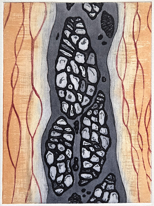
Adapting a design through colour
How to develop an image through colour choices and what happens when plate direction goes astray.
-

2025 11 13 Image of the week
A small dive into surrealist painting with Lee Madgwick.
-

Pushing a print project further
Take a successful print design and evolve it into a new and larger piece.
-
2025 11 03 Image of the week
Art Werger, an exceptionally talented printmaker
-

Printmaking skills extension workshop
Exploring image transfer, origami printing and stencilling.
-

Creating a hollow back book
Hollow back book construction is straight forward with step-by-step instructions.
-

Exhibition: Crescendo 2025
View an amazing array of unique artists books created by 61 participants with a wide range of binding and creative skills.
-
2025 09 09 Image of the week
Claudia Cron engages me with her beautifully creative imagery.
Welcome, and I hope you enjoy my creative journey…
My blog documents my (mainly) print and creative pursuits, both those that are successful and those that aren’t. I post many step-by-step processes as a personal record but also to aid others following similar paths looking for instruction, tips and ideas. I hope you find it useful.
My galleries showcase some of my favourite works including an ever increasing range of artist books I enjoy creating.
If you’ve any questions, advice or just want to comment please feel free to contact me. I’d love to hear from you!