A couple of weeks ago I was searching through my somewhat disorganised sketchbooks for something to translate into a photopolymer intaglio print (a solar plate print). This is my least favourite print style (after screenprinting) for a number of reasons.
- The print plate is exposed in one go, under an ultra-violet light. Yes, sections can be masked so the light hits different areas for different lengths of time but this can be a hit and miss situation.
- Ultra-violet lights aren’t all the same. Some shine ultra-violet which indicates they are strong but the one I have access to in the communal studio shines yellow, so is a very low level light. How is one supposed to assess the length of time to expose the plates for? Run some trials I hear you say but I’m left at a loss when the tutor gives differing lengths of exposure time to each student, all of us with similar black printed acetate. Truth is, if I can’t understand it completely my results are either very lucky or very unlucky.
- It’s essential to choose a design that has a variety of tonal variation otherwise the plate will expose all marks equally thereby creating a print matrix with the same tonal depth throughout. Boring.
- Once the plate has been exposed, cured and is ready to print it’s possible to scratch into it and create more marks and detail. I’ve had no success with this whatsoever.
- It’s terrific for detailed hand drawings and can produce very fine imagery. That type of drawing isn’t my strong point. Some people use images from photographs and I did that some years ago. Can’t see the point, where’s the design aspect? Some of my classmates have ‘collaged’ black and white photos together to make new designs and they’re fine, but not what I want.
- But my biggest issue is with the inking of the plate. Despite my plates having been cured for over a week if I accidentally take too much ink off the surface the paper sticks. It’s an intaglio method, so there is meant to be minimal ink on the relief surface but there’s a fine line here between leaving too much and having excessive plate tone or wiping away too much and having your paper stick.
And don’t even think about using handmade paper. Here’s my result.

The exposed plate (on the left) has wording well etched into the surface. On the right, part of it was printed using handmade paper from recycled 100% cotton rage paper offcuts, essentially recycled BFK Rives printmaking paper. I spent 2 hours trying to remove the stuck paper before abandoning the idea and chucking the lot in the bin. Tiny pieces of paper can be removed very carefully with a cotton bud but this can (and likely will) affect the remaining surface.
So why am I doing this again? Just trying not to deviate too far from the class print method chosen by the tutor for this term. Being a team player.
OK, back to my sketchbook. A while ago I messed about with watercolours; layering them and blowing them around the page with a straw. One piece has loads of tonal variety. I thought I’d give it a go so went ahead, gave it a trim and enlarged it to the correct size and translated it into a black and clear acetate.

Looking good so far. The acetate went on top of the photopolymer plate and under the lamp for 3 1/2 minutes before being carefully washed out for 5 minutes, dried and cured back under the light for 10 minutes, then out in the sun. It was printed the following week.


The black parts of the original design bit very deeply into the plate and although ink is applied into the recesses many of them don’t print as the damp paper won’t reach into the narrow deep spaces. The paper also doesn’t sink into the areas surrounding small relief sections, as can be seen from the close-up image here.
So this print could be described as a mistake, something where the differing levels of the plate are so extreme they can be inked up but not everything will transfer to the paper.
A mistake? The happiest printing accident I’ve had for a long time in my view. What a terrific effect, I couldn’t have hoped for anything better EXCEPT the paper stuck in a little of the wiped back light tones. What a pain.
Hoping to avoid this I re-inked and applied a roll-over in orange. The aim was to ensure that the higher relief areas were inked. This enabled me to wipe back the black as far as I wanted from the surface as they were then coated in orange ink.

Wow, these are so heavy. The orange was prepared for class use and, for my project, I feel there was simply too much ink on the roller. The second image has a slightly lighter touch so more of the layers can be seen but this isn’t yet what I want it to be.
I liked the image transfer remaining on the roller though so I grabbed a piece of paper and, in the guise of cleaning it for the next person, I rolled it across the surface.

The following week I tried viscosity printing. A great technique, if a little approximate in a class setting with shared ink.
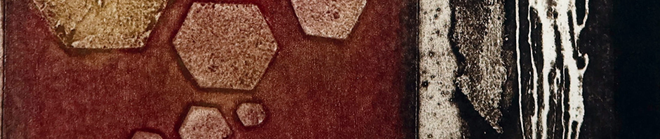
I started by inking my intaglio design in Paynes Grey and wiping back. Using a very hard roller and a low viscosity (ink mixed with linseed oil) yellow ink I lightly rolled over the surface of the plate. This was followed by a second rolling over the surface but this time using a high viscosity (thicker) ink in red with a soft roller.
The concept is that where the yellow oily ink has adhered to the plate topmost surface the red will be rejected. The use of the soft roller with the red should force the colour into some of the crevices where the yellow couldn’t reach.

Barely a semblance of yellow in evidence but it’s obviously there – probably reducing the strength in some of the grey areas – because it’s resisted the red in some places.
This final print is looking great: the image is sharp, I’ve still got those wonderful white areas where the ink is missing, the layers are strong and the colours work well together.
A mistake? No, this plate has turned out to be a lucky accident.

Pingback: Exploring viscosity printing | Tactual Textiles by Claire