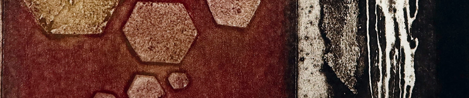
I’m really thrilled to have a piece in the above exhibition coming up in just a few weeks. There are about 25 of us showcasing a variety of printmaking techniques, mine is (of course) a collagraph.
In addition to our individual works we have joined together to create a large collaborative wall display of unframed smaller prints. When I say ‘unframed’ I mean not framed in the traditional sense. I’ll be posting images of mine here soon, so the idea will become clear.
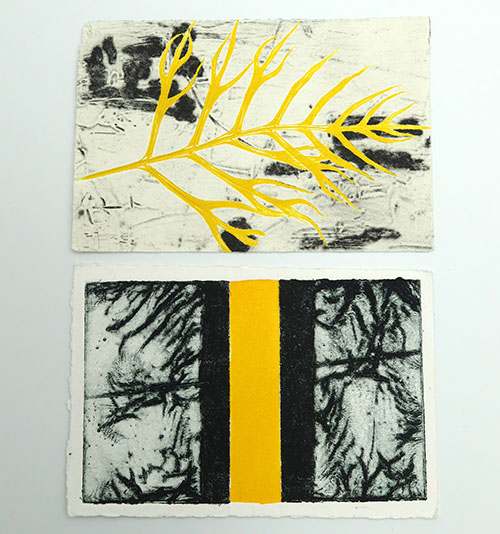
In February I joined a printmaking postcard swap with the theme ‘Hello Yellow’ and posted the step-by-step process to create my entry.
I mailed 11 of my edition, keeping one for myself, and was told that 46 people participated: from Australia, the UK, Netherlands, USA, Canada, Slovenia and Pakistan (unfortunately 3 from Iran were unable to send their entries). I’ve recently received an assortment of 10 cards, as one is always kept by the challenge organisers and displayed as part of future larger printmaking exhibitions.
The ones that appeal to me most include one from fellow group member, Lorraine, who doesn’t live too far from me. It appears to be a collagraph plate lightly inked in grey or black with an inked plant frond overlaid. As there’s no obvious ink under the plant it looks like it was placed on the background and run through the press in one pull. Great effect.
The second one I’ve shown here is from Maja Ljubic from Slovenia. She’s added the title ‘Yellow Between Them’. I think this is an etching possibly with the yellow strip having been added afterwards.
Marilee Salvator’s website is a feast for the eyes showcasing some outstanding art. Spend a few minutes browsing her installations, prints, mixed media pieces and then check out some collaborations she’s undertaken. Beautiful works.
Broadhurst Gallery Hazelhurst Arts Centre 782 Kingsway, Gymea, NSW 7-18 April 9am-4pm daily
I was really happy to get to the opening of this exhibition on Saturday and delighted to see my submission hanging alongside two other terrific pieces.
This event has no specified theme and sometimes that can cause issues when hanging as submissions are so diverse it’s difficult to group works cohesively, but that’s not the case with these pieces. The catalogue shows 101 works which include both 2D & 3D pieces: wall hanging and plinth standing.
I’m showcasing a few of the entries below.
Rebecca Trajkovski, Family of 4, acrylic on linen
Elizabeth Kauffman, The Studio after Pablo Picasso, mixed media textile art
Helen Antonoglou, The Bathers, mixed media
And finally my piece (not terribly sharp but you get the idea).
Claire Brach, Neural Network, solarplate etching
So hard to photograph these works with variable lighting in some places, angles and through glass but at least if you can’t get to the exhibition you can see some of the pieces.
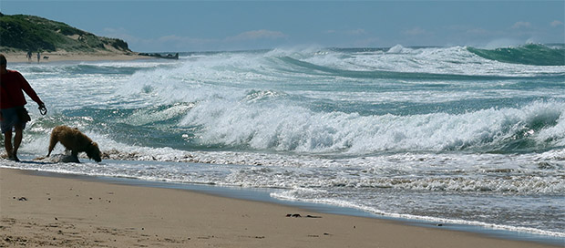
2.6 metre swell warnings were posted at the entrance to the beach today. The dogs didn’t care about the blustery conditions and ran playing together, finding new friends and having a terrific time, but they were savvy enough to stay clear of the receding high tide.
I’ve walked here for many years and never seen it so blowy.
Building swell approaching rocks
Waves rolling in and wind whipping the spray back out to sea
It was so windy it was hard to hold the camera still but there was so much beach debris, mainly marooned algae, I was determined to get a few pictures.
And Jack made a new friend.
Left: Schnapps – Beagle/Cattle Dog mix Right: Jack – Beagle/Springer Spaniel mix
Today I visited this printmaking exhibition at the Incinerator Art Space in Willoughby. The works were created by three artists who share a studio: Rhonda Nelson, Anna Russell and Anthea Boesenberg, and most had a collagraph element included in their matrix usually combined with another printing technique.
The pieces shown in the header above (Anthea Boesenberg, Atmospheres) are described as Relief Collagraph Monotypes and Andrea explained her process to us. Instead of applying ink evenly across a collagraph plate, ensuring it reaches the lower crevices, then wiping away the excess from the higher points before pulling a print she uses a roller across the surface, thereby only inking up the highest areas and prints that. By using either (or both) multiple plates or multiple colours she can create complex imagery.
Anna Russell, Transmissions 1-3, etching & collagraph, 99 x 98cm
The pieces above (grouped and sold as a whole) were the highlight of the day for me. I’m attracted to the colour scheme, the tonal variation and the layers of imagery. They’re a very cohesive group and have a vibrancy and dynamism that forces me to keep examining them and taking in every individual section. When you get up very close you can appreciate the finer marks that aren’t evident in my photo.
Rhonda Nelson, Summer Light, etched linoprint, 50 x 40cm
Etching lino is quite interesting. It can be done a couple of different ways that I know of:
A resist (a stop-out) can be painted onto selected areas of the lino so those areas aren’t eaten away by the caustic soda solution. The lino is then laid into a caustic soda + water bath and allowed to remain there while the solution reacts with the surface. Once the required effect has been achieved the lino is removed and rinsed. It’s then ready to be inked up and printed.
This method can be done progressively by putting the lino into the bath several times having stopped out more and more sections each time. This will produce differing depths of etching and create tonal variety.
Another way to etch into the surface is to mix the solution and paint it directly onto the areas of lino you want to etch. This can be rather hit and miss as the solution will run and spread but if you’re after effects such as splattering and running in rivulets across a piece it can be quite effective, if time-consuming and a little random.
When doing this in a painterly manner you could first apply a resist as with the first method. It’s a fascinating thing to do.
510 Warren Street Gallery writes on their site (in part):
Peggy Reeves works primarily with light sensitive and cameraless photographic processes. Mixing science and art opens the door to many experimental projects.
Her chemigrams are hybrids of chemistry-based photography and painting. The chemigram process involves a gradual deterioration of a resist such as varnish that leaves behind visual remnants of its creative history with chemistry. Subsequent digital editing finalizes these works, creating what Reeves considers a metaphor for natural and man-made forces on the environment.
“The Crossings” series of landscapes (pictured above & below) reference the physical and geographic challenges faced by refugees attempting to cross to the southern border of the US. In lieu of human figures, Reeves places her emphasis on the obstacles and barriers presented by the manmade and natural landscape which, in most instances, inhibits a safe crossing.
In January I made a plate which didn’t print terribly well, very dark and lacking detail. In February I reprinted it in a different colour range and was much happier with the result.
The aim was to see how a cutout area would work and also to explore tearing away mountboard layers to achieve tonal variation. I liked the cutout part, which was inked in a different colour and replaced before printing with the main plate, but didn’t like the effect of the torn layers.
Cutting into and removing differing layers of mountboard before sealing is supposed to create tonal variation but I’m unsure why this is the case. As soon as the top smooth outer layer of mountboard is cut and removed you find a ‘furry’ layer below and no matter how many layers you remove you still have the same furry appearance on each layer. So why would there be a variation in tone when the surface is always the same? Is it because more ink is held in a deeper tear? I don’t think so.
So I made a new trial plate to have another look.
From top to bottom this plate is made from the following: frayed scrim, crumpled masking tape, lightly applied carborundum gel (spread with my finger), adhesive aluminium tape, embossed paper, micaceous iron oxide (painted on the 2 dark shapes) all on the surface of a piece of mountboard. The board has been torn away at the bottom revealing different inner layers. The whole thing has been varnished a couple of times. The image above shows it after printing, hence the black areas where there’s still a bit of ink before it’s properly cleaned, it helps you to see the materials and layers.
The print has been very success in that each part has its own distinct tone and the whole thing sits well together. These components, with their differing textures, would work well to create land- or seascapes.
So what about the torn section? To my eye that area has the same tonal range throughout, regardless of depth of layering. However, ink has caught well along the tear lines, separating and highlighting each part. So maybe the answer lies not in the use of a single colour but in applying a range of colours instead. If I were to imagine this part as a rocky hilltop (or mountains in the distance) and altered the colour value (saturation) and varied the hue (warm and cool tints & shades within an analogous colour range) in selected areas that should achieve a much more varied visual outcome.
My motto: Never stop experimenting, so you always keep on learning.
Kurt Schwitters, Ausgerenkte Kräfte (Dislocated Forces) Assemblage (wood, metal spring, cloth, paper, collage) oil on board on a wooden box 105.5 x 86.7 x 9cm
In September 2017 I attended a workshop where I created several collagraph and drypoint plates, supposedly designed to be printed together. The plates have been stored since then as I was never 100% happy with the results and didn’t really know how to use them in a more effective way.
We were given some thin board, I’d hesitate to say mountboard as it had a more textural surface than my usual mountboard. Pieces were cut to size and sealed with Shellac. We then added dimension and texture on top of the Shellac.
I ‘drew’ with runny PVA glue, and then sprinkled with carborundum, on my first plate. The next one was supposed to be trees and I painted impasto paste along the trunks.
These were allowed to dry then printed with other media to create layers. I noted at the time how happy I was with the results but 6 years on, and very much more experienced, I realise what a lot of mistakes I made and how average the prints were.
Last week I reprinted the glue and carborundum plate. I inked the design in black with a blended rollover from yellow/orange to red. The rollover was very harsh and due to the height of the raised areas it didn’t look great so, using tissue paper, I gently rubbed it back and spread it more evenly, and lightly, across some of the background.
Full print and detail section
It’s a vast improvement on the original and when examining the back of the print it’s clear to see how much pressure was applied to get into every crevice.
Nothing beats trial and error, time and experience – that’s why I never throw any old printing plates away. It’s good to rummage through and revisit things that might not have worked so well first (or second) time around.
It’s the last few days of the Barbara Hepworth exhibition In Equilibrium at the Heide Museum of Modern Art in Bulleen, Victoria, and I was lucky enough to visit a few weeks ago.
Her sculptures are magnificent and I was also drawn to her framed oil and pencil renditions.
Left:Stone Sculpture, Reclining Figure, oil & pencil on gesso-prepared card, 1947 Right:Drawing for Sculpture – Santorin, oil & pencil on board, 1955
Left:Forms (Brown, Grey and White), pencil and gouache, 1941 Right:Family Group – Earth Red and Yellow, oil & pencil on hardboard, 1953
Her sculptures come in many forms, created from a variety of media and in a wide range of sizes.
Left:Oval form (Trezion), bronze on wooden base, 1964 Right:Maquette (Variation on a Theme), bronze on wooden base, 1958
Left:Corinthos, guarea wood and paint on wooden base, 1954-55 Top Right:Stringed Figure (Curlew) (Maquette), brass and string on wooden base, 1956 Bottom Right:Sculpture with Colour and Strings, bronze and string, 1939 – cast 1961
Super exhibition and I’m glad I got the opportunity to see these beautiful pieces.
I visited Wangaratta Regional Gallery to see the Printed Habitat exhibition a fortnight ago and discovered the work of Anita Laurence.
Anita Laurence, A Place in the Country, linocut, 42x56cm
This piece is part of her King Valley linocuts and etchings series, and she writes (on her website):
Inspired by where I live, creeks meet rivers and rivers meet. They are a distillation of places of significance to me with views and perspectives of iconic buildings, trees, hills, mountains, rivers and creeks.
This and many more of her artworks are for sale via the current Wangaratta exhibition and also her website.
Early in 2021 I drew a montage of tyre treads as a basis for an etching plate.
It was etched into a zinc plate, printed in several ways and 2 pieces were made into a stitched booklet for a friend.
Other copies of the print have laid around since then so last week I turned them into a back-to-back concertina as a sample for a folded books mini-workshop I taught yesterday.
The front of the concertina, above, shows two complete prints with a third cut in half creating the book ends.
The back shows three complete prints. This is a very simple glued double-sided structure and is formed by overlapping each of the prints where they fold down the middle, with half prints at either end to fill in the final sections. Mine is made of 6 prints but this concertina can be made using as many pieces as you like.
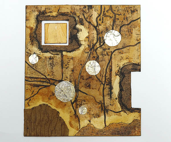
During the 5 day residential collagraph course I attended in January I created several plates and today I’m showing one that was made as a trial for a larger piece of work.
I started by cutting away 2 sections from the mountboard (retaining a smaller square) and tearing into the surrounding layers. I then carved lines into it, which reminded me of roads – hence the title ‘Journey’. This was followed by adding various other textural elements, and finished with Shellac (as per the class requirement, not my choice as previously stated).
The inks in this workshop weren’t a brand I’m familiar with so it was fun to try them out, and they were mostly mixed by the tutor 50/50 with translucent extender medium.
The first print, on the left, I felt was very heavy. The tonal variety is on its way but not yet happening. I liked the green but decided to try something less acidic. The second print is terrible. No matter how careful I was and how much I tried to wipe back specific areas I got an even worse outcome, although I like the orange effect.
The solution to this issue is to reapply more Shellac in some areas so it becomes easier to remove ink in selected places, thereby creating a wider tonal range. This is something I didn’t have time for in the class and may revisit in the future. Frankly, as it’s a test for something else I might not.
The Shellac solution was mixed 50/50 flakes with meths. It dried very quickly but I’m not convinced it’s giving me what I want. We all work differently and I’m not criticising the tutor because he is getting the effects he wants from his method, but I prefer varnishing instead.
On Friday I revisited the plate. Since the workshop I’ve purchased the same brand of ink and they’re lovely. The colours & consistency are super, and they’re easy to spread.
The left sample has been inked in grey instead of the harsher black from the two previous attempts. It still hasn’t worked well and the red colour isn’t strong enough. Without cleaning the plate I applied Sanguine over the surface, adding a little extra grey here and there, and on the focal square. It’s a vast improvement when measured against the others.
So what has been learned from this experimentation?
I still don’t like Shellac sealer.
Altering a colour scheme can improve a print to a certain degree but when the hardware: i.e. the print matrix, isn’t up to par there’s only so much you can do to improve the printed outcome before you need to return to the matrix itself and make changes.
I like the cut and re-inserted square, so will use that concept going forward.
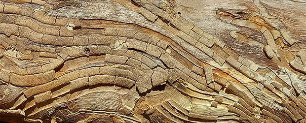
This week I couldn’t choose between these two amazing close-up images of the peeling & disintegrating bark of a fallen tree I came across on one of my recent bush walks.
I recently joined a postcard swap challenge. The aim is to print 12 postcards responding to the theme ‘Hello Yellow’ and post 11 of them to a central address. The coordinator then keeps one for the group archives and divides the others up between participants and posts a selection of 10 back to each person who contributed. So, assuming more than 10 people around the world take part, there will be a wide variety of prints to share out and each set will potentially be different.
As I thoroughly enjoyed working with my latest linocut (Reflections from the Pier) I decided to adapt it for this.
The first layer is a simple roll over on uncarved lino using masks as per the previous project. I cut my masks and stencils from various weights of acetate – 100, 150 or 250 micron, depending on what I want to use them for.
These ones are very fine, 100 micron, which work well for most projects because when using them to print over multiple layers there is no chance of them creating a ‘halo’ around the edges where the paper hasn’t reached the printing ink on the lino.
The downside is, of course, they aren’t very sturdy and tend to bend easily, so placement can be tricky with long thin strips. Dropping a circular shape down is easy but holding linear pieces is less precise as they buckle when trying to get them in exactly the right spot.
The second layer involved masking off the majority of the cut lino so I could place the postcards down in the same area each time. After all, they are supposed to be an edition of 12. Here I mixed a mid-tone grey with plenty of extender medium to create a semi-transparent layer
You can just about see in the image above where after rolling up I’ve wiped away the grey from two of the small circles as the goal is for these to be brilliant yellow.
And here they are, fully completed, dried and ready to post.
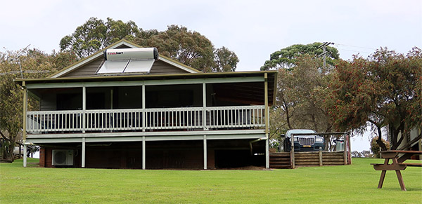
In November my husband and I had a few days away in a rented holiday cottage. A beautiful venue, only 8 onsite cottages, lovely helpful management couple and 40 acres for us to roam.
The best thing was the view from the balcony.
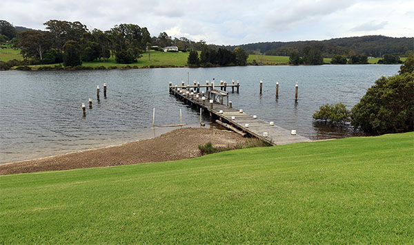
When strolling around the property each day we would wander along the pier hoping to spot some fish. I gazed down into the water watching the pier reflection rippling and bubbles rising and bursting on the water’s surface.
Purely from imagination, and using silk cut lino, I created my version of rippled reflections of the pier struts, plant fronds and bubbles. I’ve two main iterations, very similar but with slight changes to the pier sections. The first one is blue based, demonstrating a watery effect – the second is more green based, indicating algae on the posts.
Technique: Only one piece of lino was used to produce these prints. Base layer monoprint with stencils on uncarved lino, followed by 5 linocut layers using masks and selective inking, oil-based inks on 200gsm digital copy paper.
It was late 2021 when I started this project and posted my first Brain Clutter series collagraph (see here) and I’ve been keen to return to the theme ever since.
Last week, at a 5 day residential collagraph workshop I created a new experimental plate, and followers of my site will have seen a finished print using it for my recent print commission here. Having been away from this theme for a year this is a trial to see how I feel about picking the thread up again – and I’ve decided I like it.
It’s a good stand-alone piece and exploration for the series. I’m using the plate as inspiration and will remake it using the same format as the first piece; size and shape, essentially.
We sealed our plates using Shellac, which is a product I moved away from a while ago for a few reasons:
It smells and brush clean-up is with meths.
Unused solution can get tiny lumps in it over time and these aren’t always visible on the plate but definitely affect the print outcome (yep, been down that route!).
Shellac colours the surface of the print plate and this can make it difficult to see where ink is either over-applied or too aggressively rubbed back (that’s another one I know all about).
On at least one occasion it only dried to a tacky finish, rendering the plate unusable. Was this because of other products on the plate surface designed to create texture but impeding the drying of the Shellac? I don’t know.
Drying time can be affected by concentration of solution, temperature and humidity.
Despite this, and being in a class situation, I sealed my plate with Shellac.
The base is mountboard with the remainder being a mix of cut away areas and additions of mesh, gels, glue, tapes, carborundum and the like.
Above left: this was the first print, in sepia, and the tonal variety and crisp finish simply isn’t there. The composition is good, some of the components have potential but overall it’s very average. Sepia over a golden Shellac base isn’t my ideal choice to see where I’ve inked and where I need to work further. Above right: the whole plate was inked in stormy grey with yellow applied over the surface on the right, thus making green. Using a cotton bud I wiped away ink from the horizontal and vertical lines encouraging them to become more prominent. Happy with that bit but there’s still work to do on other sections.
Above left: I tried a new ink colour, Van Dyck brown. That won’t be happening again, vile colour. Too much ink removed from the plate but the vertical and horizontal lines have worked well. Above right: stormy grey and orange. This was the final print of the course and was inked and rubbed back in 3 minutes flat, hence the lines aren’t as sharp as I’d like but the rest isn’t bad at all. Time was short, I didn’t want the ink to go to waste and it was worth another quick look. The colours are terrific.
So what have I learnt so far from this collagraph?
I love the concept.
The vertical self-adhesive aluminium tape strip has worked well but the PVA glue lines need to be more robust.
The glue/carborundum areas on the right aren’t bad but probably need another layer of Shellac to help create tonal variation.
The left hand blocks are a good idea but there’s not sufficient variation in their surfaces for them to pop out as individual components. I need a better range of items with more tonal variety.
I won’t be continuing down the Shellac route and the project plate I make from this experimentation will be varnished as per the original.
Bobby Baugh, Fierce and Unrelenting – Art Quilt Monotype printing by hand and direct painting with archival acrylic paints. Includes relief printing, resist printing, stencils and direct painting. Collage construction and machine stitching and quilting. The entire surface is richly textured with quilting stitching.
I have long been a huge fan of Bobby Baugh’s work and wish I could justify the expense to buy one of her amazing art quilts. The piece above has a lovely write-up on her site as well as several close-up images of sections of the work. I enjoy simply perusing her pieces and seeing how she cleverly hangs them on walls in mock-up house interiors.
This is a person with a terrific imagination and an outstanding skill in interpreting complex imagery into unified art pieces.
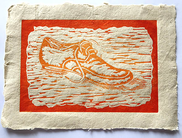
For the final piece for this commission I went back to one of my very old linocut pieces based on a drawing of a shoe I did in 2014.
The previous two prints I created both relied on damp paper to get good image transfer, but lino printing is traditionally done on dry paper, so a very different approach on the handmade paper from the watercolour monotype and the collagraph.
Plant fibre paper is very often a little ‘hairy’. It’s the nature of the fibres when they dry on the surface of the sheet so my concern was whether this aspect would detract from the image and blur it somewhat.
Colour choice was also important because it needed to be strong enough to maintain some density against the colour of the paper.
I inked the entire plate in medium orange, followed by burnt orange on the outer sections to create a strong frame. The image has transferred well, it has solid coverage, the colour gradation is good and it marries well with the background colour.
I’m very pleased with the outcome considering the paper is both textural on the surface and not a flat sheet – as can be seen from the shadows surrounding it. Once the ink is fully dry it can, of course, be flattened under weights.
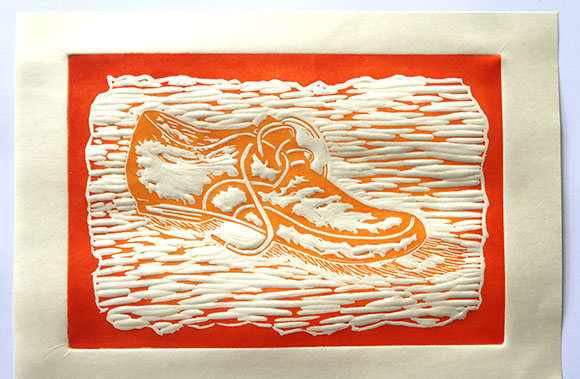
I used the remaining ink to print a copy for myself on 40gsm Croquis paper of a similar colour, to compare the image transfer against the handmade paper version.
This print hasn’t been pressed between boards to flatten it yet either and it’s easy to see where the paper has embossed in the negative space around the shoe image. That will disappear once pressed.
In my mind this second image is sharper than the first but is it really? Is it just an illusion because the paper is so obviously smooth? When I focus in on small areas I see the transfer is about the same but the paper properties make them look quite different.
I’ve enjoyed this challenge and am pleased with the 3 pieces. It’s been fun trying out the Hemp paper and seeing what will work and I hope the client likes them.
Last week I attended a 4 1/2 day collagraph workshop and created 3 new plates. I decided to try one of them on the handmade Hemp paper I’ve been sent to experiment printing with. The first piece I printed for the client is here.
Piece 2: Collagraph with oil-based inks
The collagraph matrix was created using mountboard as the base with some areas cut away. Texture was applied to the surface including: PVA glue, Hornby Train ballast (a grey coarse grit used to shore up miniature train tracks), adhesive aluminium tape, fine mesh, micaceous iron oxide, carborundum gel, masking tape and thin papers. The plate was then sealed using Shellac.
The Hemp paper was dampened in the same manner as the previous piece; liberally spritzed front and back before blotting and running through the etching press.
I chose to print on the smoothest side of the paper hoping to get a crisp image and I think it’s come out pretty good. Again, the paper seems to be unsized so it has grabbed the ink and held on to a lot of colour.
Overall I’m happy with the outcome but will probably work further with this plate and adapt it to create more tonal variation.
I was recently engaged to explore printing on handmade Hemp paper by someone who intends to market this paper for sale. I was given a general idea of what was required based on some work I had done previously.
Piece 1: Watercolour monotype
Using perspex as my base and very diluted watercolour paints I applied paint to the surface allowing it to bead, run and blend as it wished. Once dry, using a damp cloth I wiped away circular shapes and, using much more intense colours, I painted circles.
When dry, using a black Inktense pencil dipped in water, I drew lines and outlines.
I’ve done this type of printing many times in the past but always on smooth watercolour or printmaking paper and I know the image transfers well on to these. As the paint and pencil marks are fully dry when running the plate and paper through the press it’s necessary to ensure the paper is well dampened otherwise the media will not reactivate and transfer successfully.
In this case my fear was twofold: how wet could I make a piece of 240gsm handmade paper without it falling apart (as it’s unsized I believe) and, as the paper structure is fairly uneven, how much of the image would carry across. Examining the paper surface carefully I noted that it has a very fine textural surface; either from the mold used when pulling the sheet, the cloth it was pressed on or the board it was dried on I imagine.
So here’s the finished piece with some observations.
It’s obvious to see the uneven and textural paper surface have played a key role in the final appearance.
Despite the paper being heavily spritzed both back and front until it was as wet as possible without rivulets of water (!!) on the surface AND it going through a highly pressured etching press the image remains grainy.
The watercolours used were pure colours, very bright and vibrant – as can be seen from the acetate photos above – the natural Hemp coloured paper has dulled them significantly.
In most places the black Inktense pencil lines did not come across well at all and was touched up after printing.
The result is roughly what I expected from the materials I was asked to work with. Let’s see what the client thinks. Meantime, I’ll print some other styles to give him a few different choices.
I’ve been painting acid-free tissue paper – to use when printing – in preparation for a 5 day collagraph course I’m about to attend. I used very watered-down acrylic paints, allowed the tissue to dry and then ironed the pieces flat, as the watery solution crinkled the paper.
They are beautifully translucent, with each one being around A4 in size. The wet paints slightly pooled where the tissue crinkled, creating texture and blending of colours.
I’m looking forward to seeing how I can use them in the upcoming course.
On recent visits to the papermaking studio I’ve been exploring laminating paper. In papermaking terms this means layering multiple pulled pieces together into a single finished sheet.
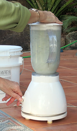
I started with white: as much as possible recycled cotton rag printing paper offcuts I’d prepared by shredding, soaking and putting through a blender.
My next layer was to be some sort of plant fibre and as this was an experimental exercise I wasn’t too worried about what that fibre was, so I scoured the studio for buckets with leftovers. I found one labelled ‘plant ground cover’ which looked like a good colour for what I wanted.
We were lucky to have been donated a whole lot of semi prepared plant fibres from the family of a member no longer able to continue making paper so we weren’t 100% sure what each of the plants were but as she had been very successful over many years we were confident that whatever the plants were they would do the job.
Before applying my plant fibre pulp to the surface of the white I laid some threads and string over the first layer to see if I could achieve some textural elements.
The mold (I never know if this should be spelt mold or mould – feel free to advise me in the comments if you wish) and deckle were partially dipped into the pulp and then applied over the first layer.
Not a bad start and quite landscape-like, so I continued.
When these came out of the press the texture of the cords and threads remained very evident which was what I wanted, but the paper surface itself was very flat. I took them home to dry along with another piece where I also incorporated some ripped up scrim (a very lightweight cotton muslin). Three dried beautifully flat, one (above right) buckled a little and the final one dried and popped off the drying surface and dried very misshapen.
Such a nice idea but so disappointed in the end result. I re-dampened and tried flattening it over several days but as soon as it came out from under my pile of books – completely dry – I watched it slowly return to this severely curved shape.
I went back to the studio for another go, making some changes. I started with a thicker, more robust, white sheet, laid out my string and placed the plant fibre pulp on top. This time, to create more texture, I added more pulp by hand. I plucked fibre from the vat and squeezed some of the moisture out before pressing it onto the surface. It reminded me of making sandcastles on the beach as a child!
Close-up of texture and added scrim
To retain the texture I decided not to compress this piece through the nipping press but to gently apply dry couching cloths to the surface by hand and hope that would be enough for it to form a sheet without becoming too flat. I took it home to dry and the same thing happened – 5 days later it looked like a poppadom! Not happy.
In desperation I ran it under the tap and laid it out to dry again. This hadn’t worked with my previous attempt but I couldn’t think what else to do. I put down 3 couching cloths, placed my fragile wet paper on top, another 3 couching cloths, then a thick piece of sponge foam, and finally a rigid board and some heavy books. The foam moulded into the texture without letting the weight of the board and books flatten it out. Every day for 2 weeks I changed the couching cloths for dry ones and remade the stack.
Finally I achieved something usable.
Final sheet prior to cutting off excess strings
So why hasn’t this been working for me very well? I suspect it’s to do with the variation in thickness across the sheet. The top is only a single layer of white but the lower portion has string and threads inserted and at least a couple of layers of plant fibre pulp – with the last sample having even more hand-applied pulp. The drying rate over multiple layers (thicker areas) will be different/longer than that of a single layer and because fibre shrinks as it dries this will have happened unevenly causing the thinner sections to lift from the drying board whilst the rest remained damp and still stuck down.
This is the only explanation I can come up with and it seems quite logical. The only way to remedy this, that I can think of, is to do exactly what I did the final time and leave very damp paper under weights for a significant length of time to ensure it’s flat and encourage it to stay flat.
What about ironing it? Well that would be fine if I was happy to forgo my carefully created textural paper surface, which I’m not.
Obviously more to work on here but now I need to decide what I want to print on this barren looking landscape.
Every December our print group cut up either failed or excess prints produced during the year and swap with each other to create small concertina books.
Our group is full of very experienced printmakers, most of whom specialize in specific printing techniques, which makes it an excellent place to continue learning and sharing skills. We have individuals who excel in lino-cutting, monoprinting & monotypes, solar plate etching, zinc and copper etching and collagraphs (my area).
So swapping print scraps brings a range of techniques into a unified whole and provides a reminder of some of the processes we each undertook over the preceding 4 terms.
It also provides a way to rescue those images each of us felt didn’t really work. It’s astounding how something that was obviously a ‘failure’ – to the artist who produced it – transforms into a small piece of wonderful art when cropped, rotated, and a new point of focal interest is chosen. Colour plays a big part as well, of course.
This year I made hard covers for my book, pictured above, from some abstract painting I did a while ago. Below is the completed front and back concertina.
Several weeks ago I created a new collagraph plate which I decided to use as a swap project print. I blogged about the trials here. This week I’ve completed a series of 13 – 12 to swap and 1 for myself.
I thought a lot about colour choices and despite my last post saying I was hankering after further colour experimentation I decided to continue down my original route. I wasn’t feeling the love for blues, purples and greens. I’d previously inked in paynes grey and it wasn’t giving me the dynamism I was after. So I stuck with my three original choices (black, yellow and red) but altered them, from my first trials, within those hues.
Not only do I enjoy experimenting with different print styles but I also like exploring different ink brands, always oil-based. For this project all products are etching inks.
I chose Gamblin Bone Black as my main colour – a really good velvety deep black which covers well and wipes back easily. Graphic Chemical & Ink Co Diarylide Yellow as my secondary – a very lairy, bright colour. Blends beautifully with black to create an olive green hue which reduces the brilliance but maintains an intensity. Charbonnel Geranium Red as my point of difference – a cool red, edging towards magenta but not so acidic.
Additional varnishing and reapplying the linework improved the outcome and having ticked my requirements boxes (colour choice, tonal variety, orientation) I set to work to produce my edition.
The longer I worked the more I observed in the design and decided ‘Scribbles’ was a good working title but not for the finished prints. Now I see the outer curvatures as objects I’m looking between towards an opening where I discover the scribbles. Perhaps I’m viewing something through a fish-eye lens, showing distortion of objects.
My notations, once the prints are fully dry, will record this print title as ‘Looking Up’.
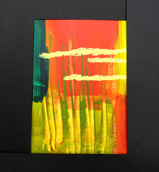
It’s been a stressful week so it seemed like a good time to take a few minutes away from other people to mess about in the studio with some loud music, a bit of paper and some pens.
Going through my stash I landed on one of the pieces I recently painted that I previously blogged about here. I liked it a lot when I painted it but didn’t know what to do with it; whether to work further into the piece, leave it alone, cut it up, make it into a book cover or whatever. It went into my ever-growing pile waiting for further inspiration and today was the day. So this was what I started with:
I folded and cut it into a simple folded booklet.
From the images you can see how the piece is manipulated and folded into a single 4 page booklet. As this is 200gsm paper, covered with a couple of layers of acrylic paint it’s hard to get it to fold down to a book shape without slipping out of alignment so I applied glue to some areas and trimmed where necessary until I had a good solid structure.
Then I got my black Sharpie out. It really felt like a black Sharpie day, along with a ruler and a few homemade stencils.
Well, that’s relieved my brains a bit. Back to the real world.
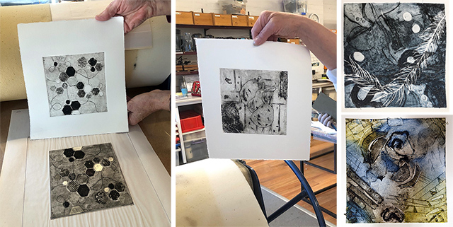
I had a quick dip into the world of monotypes recently after watching a few short videos. Essentially I spent a bit of time with ink, scrapers and credit cards to see what marks I could make.
These two were fun. I initially thought they were a bit disjointed but I think there’s scope to work further into them and my creative experience tells me that I’ll never get anywhere unless I continue to experiment, whether it works or not.
I then picked up a couple of stencils, some black ink and a paint scraper.
This feels a bit more together than the previous two and was worked in a different method. The top images were created by applying ink, in selected areas, to a blank piece of acetate and running it through the press multiple times – once per each tonal variation. This is called an ‘additive’ process – ink is added to a virgin base.
The third piece is worked by rolling ink over the whole piece of acetate, then removing some areas using a cloth or similar. This is called a ‘reductive’ process – the image becomes apparent where you remove the ink.
I applied a couple of stencils over the surface, removing ink between each one to get the circular patterns. Then a paint scraper was shovelled across the right hand side of the plate removing ink in small ripples.
I enjoyed this exercise. My skills are better with other types of printmaking but it’s good to have a play around with no specific outcome in mind and you never know where it might lead.
Andrea Tishman, Flock, linoprint and gouache on 32 teabags mounted on painted wood panel, 30″ x 24″
Andrea writes on her site:
I’ve long admired the diaphanous teabag. Once steeped, emptied, unfolded, and ironed, the little pieces of paper resemble parchments; small stories of collections of moments. After flattening the mottled papers, I paint them with streaks of gouache, and then hand print them with carved linoleum plates. I then mount each print on a wooden panel.
Terrific collection of images with many more examples on her site.
Back in 2017 I attended a very good and frantically busy workshop exploring a range of printing methods. During the course we each constructed a collagraph plate, Shellacked, then inked and printed them. This was mine:
On the left is the basic plate – mountboard, torn masking tape, PVA glue with gritty sand sprinkled over, cut textural paper and narrow knife slashes through the board. On the right is the plate once Shellacked, making the textures more visible.
I’ve always liked this plate but have had difficulty getting the glue & grit part to print well. I looked at my original print and did a straight forward reprint to compare.
The left image is the original print from 2017. I thought it was great at the time. Experience over the last 5 years has improved my inking ability and my understanding of how to work with printmaking paper, but I’ve still got the speckling in the grit areas.
I decided to stipple those sections with varnish hoping they would then retain ink in the recesses and on the surface to a lesser extent, giving me a fully printed area with tonal variation.
After one layer of stippled varnish this is the print result. It’s certainly eliminated the speckling but even though I tried very hard I couldn’t remove enough ink from the surface to achieve any tonal variety. Now it appears too solid and heavy compared to the rest of the piece. This isn’t what I’m seeing in my head and hasn’t as yet got to the result I’m searching for.
So, what to do? It’s an old plate and I’m happy to experiment on it and if I ruin it so be it. I’m mulling over whether to remove these heavy areas by cutting down a layer or two into the mountboard base and lifting those sections out. By doing that I can start again and create new textural effects and I might get more success.
As I’m currently involved with a few other projects this one will have to wait for a while, but I’ll get back to it eventually.
I came across this amazing collagraph on the facebook group Collagraph world wide which I’m a member of.
I’ve done a little with silk aquatint but haven’t explored it this far. Now it’s definitely on my to-do list.
The artist, Linda Jules, writes:
This print was made using a collagraph process called Silk Aquatint.
First, a piece of finely woven fabric was glued to a heavy cardboard plate and the plate was sealed with a couple of coats of gloss acrylic medium. (If the plate was inked up and wiped at this point, it would print completely black, as the ink would be held in the tiny squares between the fabric threads.)
Second, successive layers of gloss medium were applied to certain areas of the plate to build up the image: the more coats of medium applied to a certain area of the image, the less ink would be held between the fabric threads and the lighter in tone that area would be. So I had the full range of tones from black to white available to me.
This is a beach scene form Naikoon Bay on Haida Gwaii, BC, Canada.
Resources: Facebook: Collagraph world wide post 20/10/22 Linda Jules
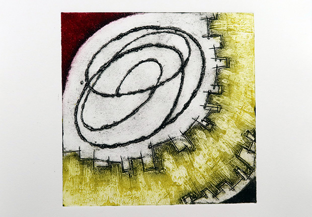
Exploring new techniques to create plates I got my mini drill out and, using a fine tip, applied it to the surface of a piece of mountboard. The aim was to produce a range of organic imprecise lines as opposed to my normal Xacto knife line drawings.
The drill churned through the layers, tearing and pushing uneven ridges up from the surface.
EXACTLY what I was hoping for. Using a paper mask I applied modelling paste to a section, incised some lines with a knife and added Akua Carborundum Gel to 2 of the corners.
The plate was varnished and a proof print taken. This allowed me to see what needed to be adjusted.
Plain mountboard, if lightly varnished – in my case only one layer – will always have a degree of tone, usually a mid-range something-and-nothing colour. And that’s what I got in the background.
The aim of my first proof was to check the balance of shapes, the direction and the intensity of the shapes. I was very happy with those and my narrow knife-drawn lines around the modelling paste were evident.
So it was time to work on the tone. I applied more varnish in selected areas. The mountboard sections surrounding the scribble had several thin layers added to take away a large portion of the plate tone, some parts had more layers than others. The scribble needed to be more dominant without being overloaded with ink as in this sample.
The paste area had achieved what I wanted with regard to shape. The whole thing was varnished again and then multiple more layers were added in parts across it. The aim was to incorporate a different colour here and wipe it back to get tonal variety.
The Akua gel gave me what I was looking for; a strong dark edging.
Once the adjustments had been done I reprinted.
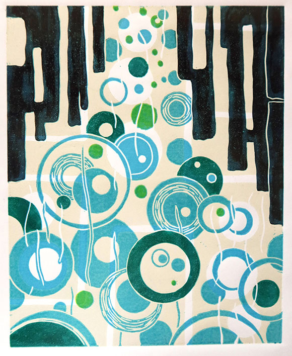
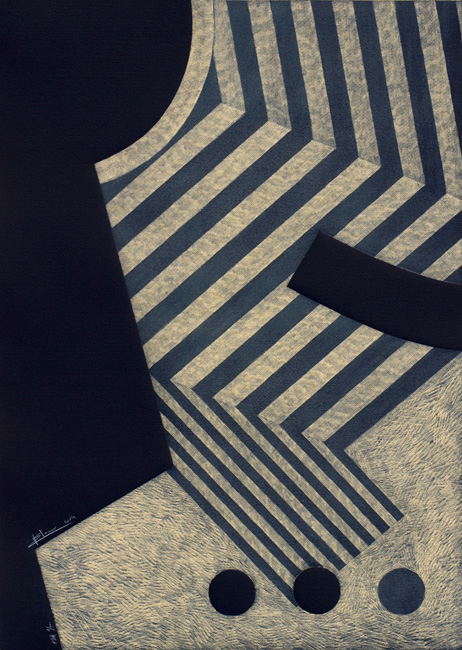
Claire Brach, Scribble, 2022, bone black, primrose yellow, cadmium red dark oil-based inks on 250gsm BFK Rives, 15 x 15cm (print size)
Terrific result: great tonal variety, dominant focal interest provided by the scribble, excellent ink coverage. Very happy with this project outcome.
Now I’ve to print an edition of 12 for a swap. That takes longer than you might think because I rework the incised lines and parts of the scribble before each print ad they’re all supposed to be identical, but I’m already hankering after some colour experimentation!
I noticed how similar my colour palettes were in my two previous pieces so decided to make some adjustments. I also took note of my comment that perhaps squiggles – a bit more organic than my blocks and lines – might work better underneath other layers.
Acrylic paints are out so I stuck with them.
This has been an interesting 5 day time-out from my normal routine and it’s reaffirmed my creative leaning in regard to shapes, blocks and lines – which has long been a part of my art.
I tried masking areas and selecting interesting sections, as I did with the last 2, but nothing really jumped at me so I’m just showing the whole piece.
Even though this type of art isn’t something I’ll avidly pursue I think the results have been worth recording and this type of imagery might come in useful in the future. It’s always worth having a stash of different arty outcomes, you never know when they might come in useful or if another idea pops into your head triggered by these.
Day 5 of the exercise was a wash-out and I didn’t do anything. The guy spent a lot of time directing his comments to those who posted they were daunted, had life experiences that halted them in their progress, had no materials (not sure why you would sign up then), were traumatized by family tragedies, had been told they were useless as children and so on. Then he moved to spruiking his upcoming paid painting course, which isn’t for me.
This solo exhibition by Helen MacRitchie has been showing throughout September, ending on 2nd October. I’ve know Helen for many years and always admired her artworks.
Left Top: Rosella, Bottom: Lorikeet, Right Top: Eucalyptus I, Middle: Kookaburra, Bottom: Eucalyptus II All: wool roving, merino wool yarn, 30w x 30h x 4d cm
The basis of her practice is wet felted wool on which she creates layered textural surfaces or sculptural forms. She is spectacular with a sewing machine and her free-motion stitching brings a completely different textural aspect to her art when set against the softness of the felting. She dyes her own yarns, threads, fibre and fabrics and is adept at choosing colours that work harmoniously together and to her theme.
Leodhas (Lewis), wool roving, silk, flax, stones, 70w x 120h cm
The exhibition publicity details how, through her art works, Helen examines her life in Scotland, Australia and England, reflecting on her feeling of home for each of these particular places. Topophilia, more than simply a liking of a place, suggests a cultural connection, a sense of belonging. Recurring felting, wrapping and embroidery techniques with intertwining and nest motifs express this visually. Ancestry, heritage, memories and colourful vistas past and present are her inspiration and points of topophilic identification.
Left: Cumbrae Rockpools, wool roving, wool yarn, linen yarn,cotton canvas, recycled wooden deckchair frame, 50w x 120h cm Right: Jurassic Stone, wool roving, wool yarn, perspex, plastic tubing, thermoplastic, polymer, garden ties, 60w x 180h x 7d
Wrapped nest – Sea Ivory, wool roving, wool yarn, beads, cotton thread, 40w x 40h x 4d cm
This exhibition was a feast for the eyes, with a very different feel and sense of place for each of the locations depicted. I spent a lovely morning walking around the gallery with Helen while learning the inspiration behind each piece as well as many of the techniques she employed.
Good lunch together at a local cafe afterwards as well.
On day 3 of the challenge I stuck with acrylic paints, as I enjoyed them so much on the first day.
After painting this piece I became stuck on what to do with it next. So I left it alone and tried blocking areas to see what I like about it. I placed ‘L’ shaped pieces of black paper onto the surface, moving them around until I saw something that attracted me.
Mmmmm…. not sure about it but it seems quite lively.
Don’t mind this one but I can’t say I’m super engaged with it.
Again, I’m not sure. Is there something missing or is it a case of ‘less is more’?
What did I learn today? It’s fun mucking around with paint but let’s not get too excited – I think the whole exercise is revealing that in my heart I’m not a painter, printmaking is the way to go for me.
This is a close-up photo using my phone, which is what I have to hand when walking my dog on bush trails. This image, in a similar manner to my previously featured Banksia photo, seems over-detailed (too sharp?) if that makes sense. I must take the camera, rephotograph and compare the shots.
Anyway, back to the subject. This is a section of a Scribbly gum trunk. I’ve always wondered what makes these amazing track marks and Google tells me:
The scribbly gum is a native Australian eucalyptus tree which is easy to spot because of the distinctive markings along its smooth yellow-gray trunk. These zig-zag tracks or ‘scribbles’ are made by the moth grub as it tunnels between the old and new bark.
Last week two friends and I decided to join a 5 day on-line creative challenge. The basis was supposed to be painting but the ethos was pretty much ‘anything goes’. As it was a free thing, designed to enthuse participants to sign up for further paid classes, we were encouraged to use whatever was to hand; be it any type of paints, coloured pencils, markers, collage, or whatever you can think of to get something onto paper.
I chose acrylic paints partly because I use them when I gelli plate print and have a good supply, and partly because I thought splashing around with them would be fun.
The idea was to paint along with the tutor each day during the live video, which ran for about 45 minutes. I’ve never produced anything in 45 minutes before but gave it a go. Day 1 I filled my water jar, grabbed some brushes and a sheet of 300gsm water colour paper and started opening paint tubes.
45 minutes later I had (amazingly) covered the paper in paint. I left it to dry and then added some white gel pen and black Sharpie marks.
It reminds me of …. well, me – blocks, shapes and lines. My favourite things. Of course there’s no planned composition or colour scheme but it’s glaringly obvious that I’ve pretty much avoided blue, which has been a life-long trait. In fact there are a couple of blocks painted with Pthalo blue but as they overlay other colours they’ve edged towards green.
I decided to chop it up (on Photoshop) and concentrate on specific areas.
Not a bad composition, I like the colour placement and the black Sharpie lines but by blowing it up my white pen work looks pretty approximate.
Colours good, black lines good, positioning of white shapes good, not sure I’m thrilled with the squiggles. Let’s turn it around.
I have the same issue, the left hand squiggles aren’t working for me but the rest is fine.
This one I like the best, and a smidge of blue is evident in the bottom right hand corner.
On this day I learned it’s fun to mess about without a plan and I should avoid squiggles unless they are buried under other layers.
I’ve barely posted anything recently but I’ve still been super creative and busy with a variety of projects, all that will be shared eventually.
Earlier this month I taught a one day collagraph workshop. It was fun but extremely busy and I’ve decided that the shortcuts taken to both create and print plates within a 6 hour window (where you also have to fit in lunch!) compromises the results more than I’m comfortable with. Don’t get me wrong, the participants had a terrific time and all achieved great results but with a very short drying time-span they were unable to take advantage of any of the gels and mediums now available. These products create amazing textures but usually have to dry overnight before applying ink – not an option for us.
Anyway, not to worry, they made use of both cutting into their print plate and well as adhering a variety of media to the surface, thereby achieving a good many layers and some textures to work with.
I started by showing a few of my samples and discussing what works, what to look out for and what to avoid.
I demonstrated inking up with oil-based inks.
They were soon working in both plain black and colour.
I only had time to briefly cover chine collé and masking, with a demonstration on one piece.
It was a fun, but full-on, day and the students worked very hard and left with good prints and a better understanding of the technique. I’ve already been asked to teach this for another group but, happily, it will be over 2 days.