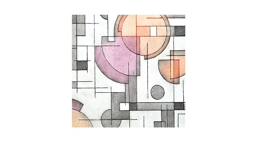
Following on from my previous solar plate prints I decided to create a relief linocut with the aim of masking and selectively inking specific areas to achieve colour and tonal variation.
Using Photoshop I created a mock-up of what I hope to be the final print. Additional components were added to reduce negative space and further balance the design.

The lino was cut and I took proof prints. Normally proofs are done in black but I wanted to look at potential highlight colours.

Masks were cut for each colour layer, a registration board was built using Ternes Burton pins to ensure accuracy, ink was rolled and the first two layers were produced.

Registration slippage was noted and (hopefully!) corrected.

Although this is a scan of the finished piece I see the orange looks rather faint. On the actual print it’s more vibrant and in evidence. Both the orange and the light grey were mixed with transparent medium and, in hindsight, that was probably not the best decision. There’s some very minor paper slippage but it’s not concerning.
This has been a huge learning experience when 100% accurate registration is required. Even 1mm out of place affects the visual outcome hugely in a piece such as this. Knowing fiddly registration can be challenging is what steered me away from a reduction print as I had no expectation regarding layering being precise. The masking method is fairly effective and the Ternes Burton pins registration works but when there is such a small amount of space between components, where there’s no allowance for error, this is the best print I could achieve – and I’m happy to accept it.


Leave a Reply