Painting, drawing and block-printing with Gary Shinfield
This workshop, which I attended over two days last weekend, had two parts to it. The first day we worked on designs, drawing and painting very randomly until we had built a small body of ideas to translate into wood-block carvings. We carved the Japanese plywood and spent the second day exploring the layered print effects we could achieve.
Whilst in the USA recently I photographed a lot of doors (static objects as opposed to the moving objects I recently wrote about) and I chose photos of some I saw on Alcatraz as my subject matter.
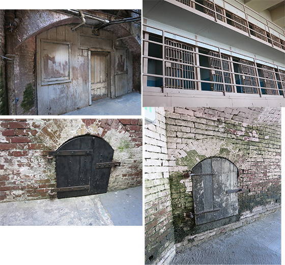 As has been discovered over the last 400 or so blog posts I’ve recorded here, I’m very tight at drawing, my designs are precise and detailed and usually small. Gary was determined that I was going to break away from this – to my mixed delight and trepidation! I chose the image bottom right as my drawing source and Gary gave me a fat Texta marker and some 50x50cm lightweight paper to play with.
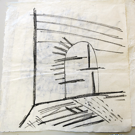 My first attempt. Yes, about the quality I expected for a 3 minute exercise (rubbish) but Gary really liked the lines and simplicity of it.
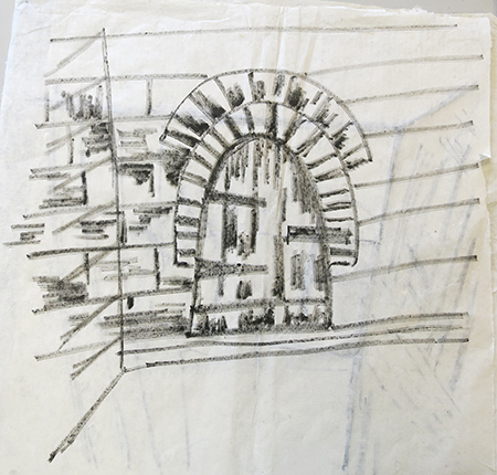 Tried to add some brickwork but quickly realised I’d got the angle on the left wrong. Quite like the door but can live without the surrounding bricks.
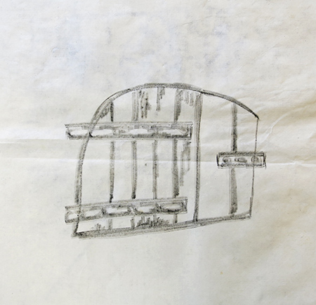 Oops, getting too detailed again, not what I was there to learn. Gary took the Texta away and gave me a horrible ragged 1″ flat brush.
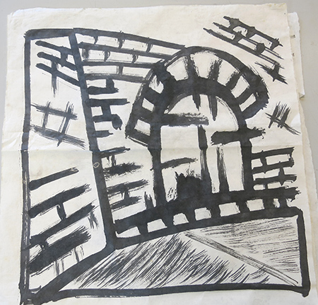 I was fairly distraught, he was very happy! I was thinking “What on earth am I doing here?”. He was still smiling. I got one more attempt and secretly sneaked a finer tipped brush to work with.
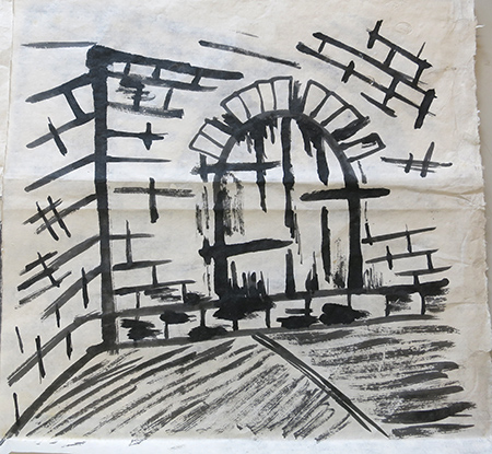 Time was up and I was given a piece of chalk, 4 pieces of Japanese plywood and told to redraw my door across the four pieces. Then cut the wood.
Note: What’s the best thing about workshops and classes? It’s the time limit. For me it’s always the time limit. It puts an end to my agonising, I HAVE TO get on with it and the result will be what it will be. However, it doesn’t seem to matter how many times I go through this and come away with some good end results I still over-plan and over-analyze at home alone.
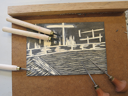
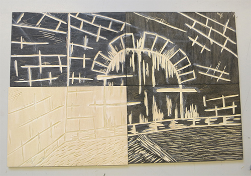 Unfortunately one of the pieces in my wood set was marginally bigger than the others – and wasn’t coloured so the chalk didn’t show very well – but never mind, I worked it out.
I took my first proof. Yes, I know, I didn’t reverse the drawing – it wasn’t at the forefront of my mind.
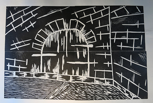 Not bad. End of the first day and I took the blocks home to carve a little more out of them. The following day I took another proof.
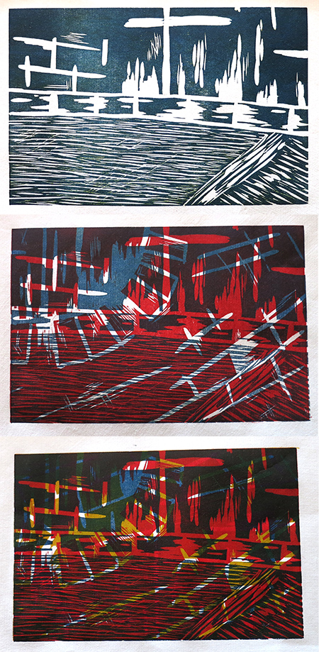
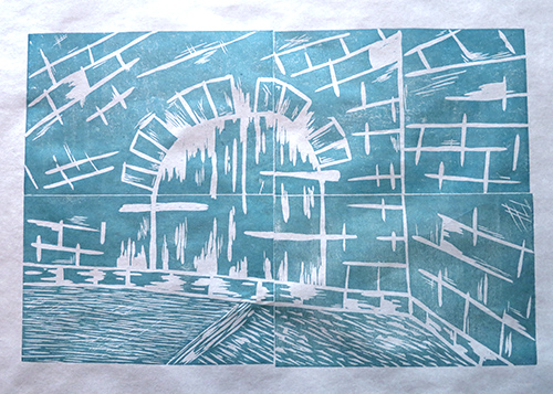 Yes, pretty happy with that. I separated the blocks, turned some around and ‘shuffled’ them so they no longer looked like jigsaw pieces which fit neatly together. Time to let go of the image and see what happens with layering and choosing random blocks together.
We mixed: 1. yellow/orange 2. light blue (similar to cyan) 3. strong blue into which we added some of the orange.
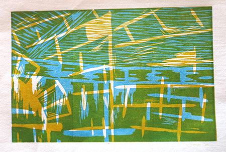 Two layers: light blue with yellow on top.
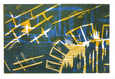 Two layers: strong blue with yellow on top.
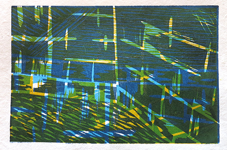 Three layers: Light blue, strong blue and yellow on top. My favourite piece of the course.
We then added a red mix to the group.
There wasn’t a lot of time left and I’d brought along my linocuts from project 7 to test how they go through the workshop press. I wanted to compare a set of prints from the big heavy press there against my smaller lightweight one.
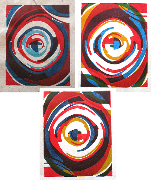 The first one is on a pale beige flecked paper and I aligned all 3 plates. The other two are on white chinese paper and I rotated the plates to give more interest. All have come out very well and I think the weight of the huge roller and the cardboard we used has definitely improved the ink take-up. During colour changes the plates were only wiped clean and then ink was re-applied, hence the shift in colour – particularly obvious with the yellow which became more and more ‘dirty’.
All paper was supplied by Gary and we were only told Chinese and Thai mulberry, cotton and linen, no weights or other info. All prints were created on dry paper as they were fairly lightweight.
This was a great workshop, introducing me to wood carving which I enjoyed immensely, and a freeing experience with imagery. Now I just need to keep it up. A big thing I learned is just how much easier it is to register multiple wood-blocks as opposed to lino. They are rigid and you can really match the corners well. Lino tends to bend a little and it’s much harder to judge by eye exactly where it is going to end up sitting.
Further information about Gary Shinfield can be found on his website: http://www.garyshinfield.info/

Pingback: T1-MMT-P4-p1-e3 Initial back drawing | Fibres of Being
Pingback: Print 1. Project 13: Design & proof prints | TactualTextiles
Pingback: Print 1. Project 15: Design 3 | TactualTextiles
Pingback: Print 1. Project 15: Review | TactualTextiles