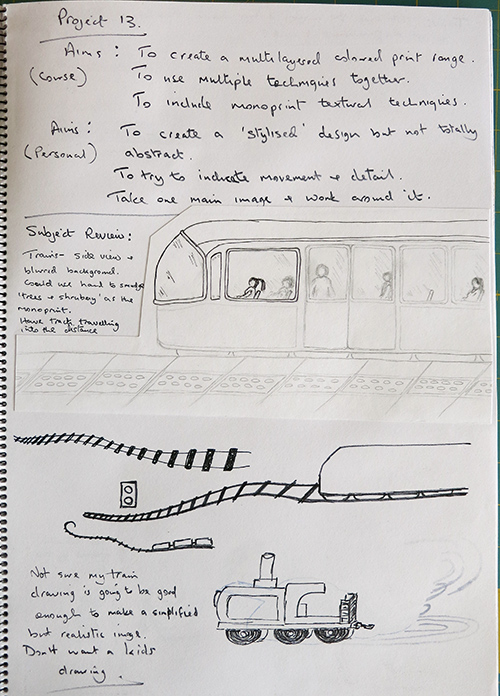
 Trains were my first thought. I like the idea of a track disappearing into the distance, but the work I did here really didn’t thrill me.
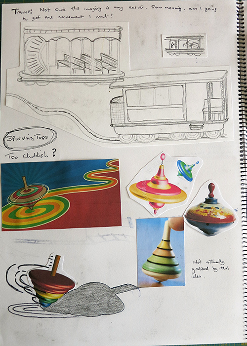 I then moved to trams but quickly realised the difficulty in drawing them. Effective drawing (even after one year of classes) is a serious downside to my skills. I know what I’m aiming for in my head but it doesn’t come out of my hands.
Spinning tops came next and I don’t mind the bottom image but by this stage my mind was moving more towards a carousel and horses concept.
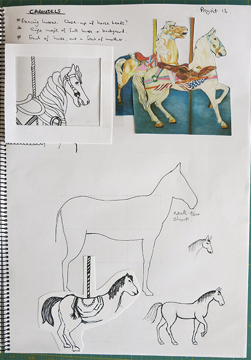 I got one of my ‘learning to draw’ books out, marked up a grid as shown and drew the static body of the horse. Of course the neck and head were separate to the grid and you have to do that by eye. So, needless to say, the neck is too short and the head looks out of proportion. I then tried another head and neck using the ‘circle’ system I found in another book – a large circle gives the shape of the upper head and skull, with a smaller circle – a little elongated – giving the shape of the nose and jaw. These are then joined by lines and you get a fairly reasonable head shape – if you’ve done the circles correctly in the first place. A bit of progress here and the small horse, bottom right, isn’t too bad despite the deformed raised front leg. The other one is a partial drawing during one of my train trips, very naff.
On the top left there is a tracing from one of my photos. I’ve added a frame to see how it would look as a single feature piece. I quite like that although it doesn’t show much life. On the right are overlapping horses but this may be too involved for the size I’ve decided to print.
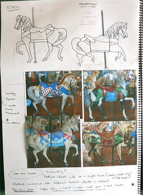 I printed out some of my photos and reverted to tracing one of the horses. I’m hoping this gives my hand and eye more of an idea where they should be. I then retraced the horse but added my own legs to show more movement, as if it were galloping. OK, nice idea, need to improve the drawing – probably go back to tracing if I can find an image with the right shaping.
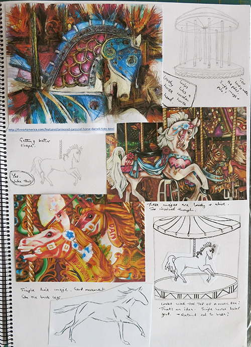 Downloaded more pictures to give me more stimuli. The top carousel I’ve drawn is too busy with the poles, just doesn’t work and I haven’t even got horses in yet. Mid left I have a fairly reasonably drawn horse, although the back leg still needs some work. I photocopied this and put it into a carousel with a down-turning awning.
I feel this drawing relates well to the top of a music box – turn the key and the little horse and carousel turn in opposite directions. The concept is becoming more interesting.
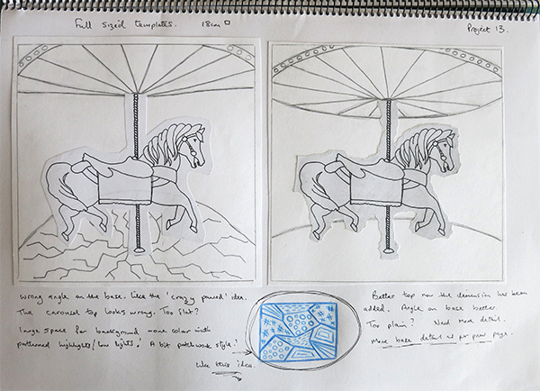 I chose 18cm square as my print size and marked out the boundaries. I photocopied my horse from a previous sketchbook page and cut out several of them, collaging each one into place with a new carousel.
Left: The carousel top is too flat, there’s something missing. The angle of the base is too steep although I like the crackle effect (not sure how to produce it but I like the idea).
Right: The carousel top is much better, I like the fact that I’ve not included the entire thing as the cropping is attractive to me. The angle of the base is better but very boring.
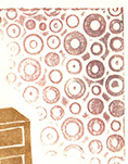 I started thinking about background effects (see blue pattern above). I am very happy with the ‘wallpaper’ I produced in project 12 and wonder if I can reproduce something similar here.
I’m supposed to be doing monoprinting and lino printing together so it would mean adding texture to the monoprint layer before printing. Well, we did that earlier in the course so it should be achievable, depending on how I want it to look. Something to keep in mind.
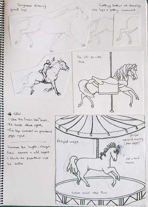 Here I downloaded a couple of excellent horse line-drawings and I concentrated on working the back legs as per the first image on the page. I then retraced my previous horse with the new back legs (middle right) and got a fairly good result.
I scanned and increased the size of one of my small drawings (still with the old horse image) to assess how the base shaping looked. It was at this stage that I made the decision to go with the base from this drawing, the improved horse above it and the dimensional carousel top from the previous page.
Once I started combining the pieces I quickly realised that I would have to change the print dimensions as I needed more height.
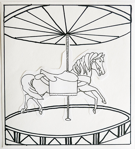 So here is the simple outline of my chosen print subject (and, yes, the horse has been photocopied again!) ready for marking onto the lino.
Colour work trials are underway.
