Since the monotype workshop last week I’ve been practicing my printing techniques, right from preparing the inks, through to rolling on the work space, rolling ink onto the lino and preparing and printing through my press. Things have improved enormously and this has led me to revisit project 6 and print new sets of samples from my shell and shoe lino cuts. I’m a little stressed about time passing but see no value in moving forward without ensuring I’ve done the best I can in this assignment with my new knowledge.
Herewith my new prints. All inks have been mixed with extender medium and all prints have gone through the press.
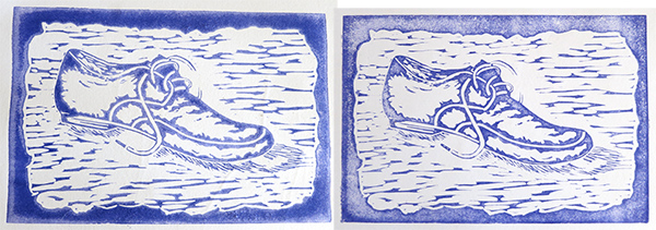 Left: Arches 88 300gsm, damp. Ultramarine blue. Not good, the paper retained way too much water and wouldn’t towel dry. The ink has pooled and even now when dry it has damp looking marks where the ink has been absorbed unevenly. Right: Canson 220gsm drawing paper, dry. Ghost print.
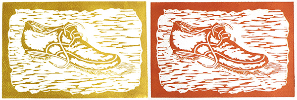 Left: Arches 250gsm, damp. Hansa yellow light + sepia. Right: Arches 250gsm, damp. Hansa yellow light + sepia + scarlet.
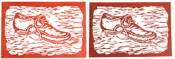 Left: Arches 250gsm, damp. Colours as above but with more scarlet added. Right: BFK Reeves 250gsm, damp. Slightly more sepia added to previous mix.
There’s a slight jump when the press roller leaves the end of the lino and the print edge sometimes slips a little. This is evident on the last print above right.
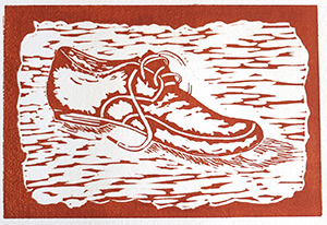 Above: BFK Reeves 250gsm, damp. The same colour mix as previous print. I’ve almost solved the press roller jump on this print.
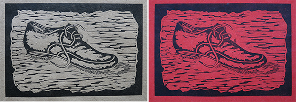 Above: I wanted to see how the image looked on coloured paper. Both prints on elephant dung paper – printed dry.
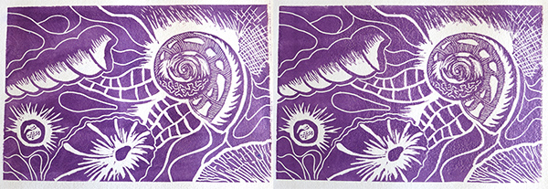 Left & Right: Arches 250gsm, damp. Ultramarine blue + napthol scarlet + quinacridone red. Very average prints. I don’t think the paper was soaked long enough and the roller (still waiting for my new better quality one to arrive) simply wouldn’t deposit the colour evenly. I was trying to get a more translucent feel by using 25% ink + 75% extender, so any rolling unevenness shows very strongly.
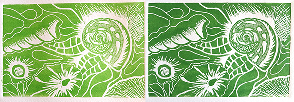 Left: Somerset 250gsm, damp. Hansa yellow light + phthalo green. Right: BFK Reeves 250gsm, damp. Same colour mix + additional phthalo green + ultramarine blue.
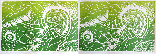 Left & Right: Somerset 250gsm, damp. The previous green mix was placed on 2/3 of the rolling area and chrome yellow hue on the other 1/3. These were then rolled and semi overlapped together to create a two-tone print. The prints have been done identically. I’m pleased that the second print has maintained an excellent colour gradation.
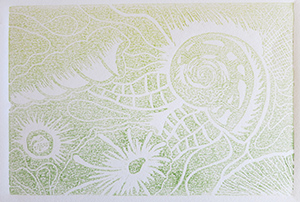 Above: 220gsm Canson drawing paper, dry. Ghost print of final image. I’m particularly pleased with this as it demonstrates how well my press is picking up the ink and depositing it on my damp paper, thereby leaving nothing for a second print. It also shows that my much thinner ink layer on the rolling plate is working well and I’m not now putting too much on the lino which could spoil the crisp images.
On all the shell prints in particular there is a slightly uneven look to the colour across the surface. It’s nothing to do with the press pressure and all to do with my roller. The new one should be here any day now.
By making some small adjustments I’ve managed to get rid of the small roller jump which spoils the final print edge and, as can be seen from the last few shell prints, I’m now achieving crisp, sharp edging to all the prints.
Huge learning curve and major steps forward over the last few days.

Wow looking really good! I take back what I said about the roller; I can see what you mean. Hopefully, the new one will make a difference.
Claire
Are you aware of something called a “runner” which you insert under the press – this eliminates the awful “jumping” as the press roller moves back down to the press bed.
So if you are working with linoleum – the ‘runner’ would be a long strip of linoleum the same length of the press bed and about one inch in width (2.5 cm). If working from a woodblock in relief – you could make a ‘runner’ from the same wood (as your matrix eg wood block plate)
It can be very useful to make ‘runners’ from mount board or the thick grey board that they often have at the back of wire bound sketch pads. Sometime layering one runner on top of another can be very useful if one is working with a ‘one off’ piece of wood, such as you might find when out for a walk in the park or forest.
One final point – to make your ‘runners’ more robust long lasting and easier to clean – I have found it useful with my lino runners, to paint PVA or Elmers glue on the hessian side – followed when good and dry with some shiny packaging tape. I so identify with all of your frustrations in the process of learning printmaking. Even after 15 years and more I am still learning new things.
My blog is http://printmakingart.blogspot.com
drop me a line if you need help/advice anytime aine@ainescannell.com
BUT as you said in your post about spending the 2 days with the practicing printmakers – nothing beats, being shown how to do things “hands – on” .
best wishes
Aine
ps I didnt know about that multi layer monotype approach so am delighted to have come across that post of yours on here. Thanks for sharing.
Hi Aine,
Thanks so much for all this info. I’ve just made some lino runners as the tutor during the 2 day course mentioned the same thing, so you’ve just confirmed how useful they are. I’ll now coat them and use the tape as well. Another thing he suggested, which is a Godsend, is to buy an offcut of flooring linoleum (the proper old fashioned cushioned type which is about 5mm thick, not the new flat vinyl flooring). This you cut to the same size, or slightly longer than, your print plate base so it is entirely covered.
The print order from base up is as follows: base of print press (mine is solid steel), cut inked lino design (straight on top of the base), print paper (over inked lino), a layer of tissue paper and then the whole thing is covered with the flooring linoleum. As the layered base plate moves towards the printer rollers the floor linoleum acts as a sort of ramp and the top roller rolls up it and over the edge of the ‘sandwich’ without bumping the side of the cut lino block – the cushioning effect of the flooring linoleum helps to smooth it as it travels. Does that make sense to you? As the base plate continues through, the top roller will gently move across the surface and then down the flooring linoleum ramp at the other end.
I’ve tried it and it has worked quite well but I think it will be even better with the side runners.
I’m just about to do my 3 colour lino prints and will photograph as I go so everyone can see the process I’m using.
Time for me to look through your blog now and check out your work.
Thanks once again for taking the time to comment here.
Pingback: Print 1. Assignment 2: First relief prints | TactualTextiles