Over the last week I’ve been preparing my  chemicals & fabrics for screen printing with thickened dyes. The first challenge was the thickened dye paste. I mixed the DR33 to a paste with methylated spirits as recommended and then started adding the chemical water. Oops, a nasty curdled mess happened very quickly. Note: I might add that I was top of my year in school for making cheese sauce from a roux base and I’m pretty good at mayonnaise as well.
So the whole lot got thrown into the blender and whizzed until smooth. Actually no, it wasn’t smooth. It had turned into twice its volume and was pure white foam. I had to wait 24 hours until it settled which was about when this photo was taken. Just a few surface bubbles remained. It was then measured out into takeaway containers and dye was added. 
I then started working out a couple of designs on Vilene interfacing as stencils. One just has some areas cut away whilst the second has some acrylic painted areas as a resist, plus some cut out areas (photo done before areas have been cut out).
I also made some repairs to the two cold wax screens I used previously. When washing them some areas of wax had come away so I re-applied it so I could compare a print using this method with my other samples.
This was my initial colour trial to see how the thickened dye travelled across the screen. On the left is the wet dye, photo immediately after application whilst still wet, and on the right is after batching. A lot of colour loss.

I did multiple prints using the bars wax resist. I overlaid it several times and didn’t worry about any ghosting effect that might happen.
Again there has been quite significant colour loss resulting in the deep red turning more pink. With this method it is difficult to maintain crisp lines because I was working wet on wet – or damp on damp at least. My base yellow had to remain wet/damp so the soda ash would activate so you can see that the red lines have blurred and spread. After batching the thick calico I can see a huge difference between this and the fabric paint screen printing. The dyeing method is fully absorbed into the cloth and the colour has bled out a little. Quite a different result to the printing inks/paints.
I left the screen with the remainder of the red on it and overprinted a damp cool-yellow base in black.
Hmmm….OK. Interesting, I guess. The faint red ghosting has given a little depth to the piece I suppose. I’m not thrilled with it but that’s because my whole nature screams neat and precise so it’s not really my type of thing.
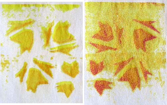
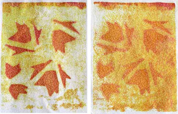
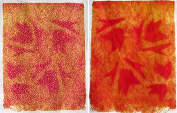
From here I moved to my cut Vilene stencil. The idea is to use a light colour first, reposition the screen and use a slightly darker or deeper colour and to keep on this way. Gradually the dyes saturate the Vilene and more colour comes through giving a variegated look to the print where the multiple colours have gradually worked their way into the fibre and finally out onto the cloth. Obviously the colour currently being worked with will fully fill the cut out motif area. The progressive results are below in the order the colours were applied. I didn’t get good coverage until right at the end and I think this was because my dyes were a little too thick so saturation took some time. I’m going to dilute the thickened paste for my next work.
 For these samples I used a white cotton with a tiny all-over white flower design.
I was interested to see if the design would disappear, be more lightly coloured or remain white (as I’m not sure how they colour an embossed design like this, so it may not take the dye). I feel that the pattern has enhanced the dyeing results and further down this post you can see where I have photographed the front and back of the final two prints to give an indication of the difference in effect.
The first piece, below left, was so boring that I repositioned the screen a little and overprinted with a tiny amount of orange hoping to cause a yellow shadow effect.


 Finally I laid out a cool-yellow base and overprinted it with turquoise to make a variegated green.
  This one lost the most colour when washing out after batching and, just because I felt like it, I took a scourer and rubbed it to death to see just how much dye I could remove. Why? Purely for my own interest.
So far this has been a big learning experience, a lot of work and slightly unexpected results.

This is really interesting, You’re a very skilled blogger.I have joinedyour rss feed and look forward to seeking more of your great post. Also, I have shared your website in my social networks!
by 迷你寫字樓
Pingback: Assignment 2 Screen Printing: Further sketchbook work | TactualTextiles