
More background experimentation – yep, I’m not done yet
Whilst making book samples recently I’ve been mulling over my Circuit project. I’ve tried quite a few different ideas as background bases for my connections and circuitry to sit upon but, as my mind is still turning this over, I’m not 100% convinced by what I’ve recently produced.
So I went back to my post of 18th April and analysed what attracted me to revisit some of the old work I featured in that post, and I considered where my interest now lies.
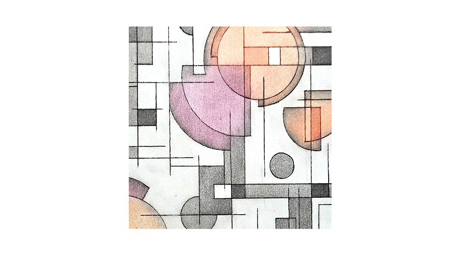
- I like structure, order and no clutter and these images mostly convey that
- I am drawn to specific shapes and repetition of these
- I’m becoming more interested in reduced colour palettes
- Splodges, random markings and non-specific spattering and daubs just aren’t in my make-up – although I admire it in others.
- My leaning is strongly towards stylisation and simplification of pattern
With these points in mind I printed, in various ways, some grid and lines samples using the following as source material.
 Left to right below: The fairly rigid sinamay (a millinery fabric) created an excellent resist for my first print but didn’t pick up much ink so didn’t print well as a stand-alone image. However, the resulting ghost print from the acetate strata created an excellent effect.
 Below: The robust cotton builders scrim (from the UK, not available here in Australia) gave pretty good results over all three techniques. Quite hard to see as I was working with a mid to light-grey ink, but in real life (not through a camera lens) these pieces are quite good for what I want.
 Left to right below: The plastic grid, which I think may be embroidery plastic canvas for learning to stitch, was quite unexpected.
No ink was able to penetrate the gaps when using it as a resist – essentially it resisted too well but I got some great embossing. However, much to my amazement, the printing ink adhered very well to the smooth plastic grid surface, producing a sharp linear outcome.
You can’t see the ghost print from the acetate plate very well but the uneven framework image that has resulted is something I like a lot.
 Left to right below: The strip of polyester fabric has created a very sharp negative image and the fabric retained enough of the ink to give a decent, if faint, image. But, again, I find myself liking the ghost print (on the right) from the acetate plate.
 So the result is that, from each of the materials, I choose the ghost print (on the right of each selection) to develop further.
Finally, some imagery and techniques I’m happy to take forward.


Leave a Reply