
The goal: to create a variation on a theme.
I’ve long been a fan of 1950s fashion and homeware print designs. I’m drawn to repetitive semi-abstract motifs, usually large bold shapes and colours. I recently saw an exhibition which included furniture and fabrics/wallpapers designed by Marion Hall Best and, while some of my print friends weren’t impressed, I loved the whole feel of her design work.


 My copy of 1950s Fashion Print by Marnie Fogg is much loved and well-thumbed.
The book is split into 5 sections:
- Abstraction
- Narrative, Novelty & the Jive
- Artistic Licence
- Kinetic
- Domestic
I’m strongly attracted to the Abstraction and Kinetic sections where the work of prominent designers of the era showcase some of the most popular fabric designs sold through the major UK retailers of the time. The book is not just a record of design plates but also charts the history of the time and the driving force behind many of the themes.
Here I feature 3 that I particularly like, although limiting myself to these has been incredibly hard.


Using my simple comma motifs I started working, by hand and later on the computer.
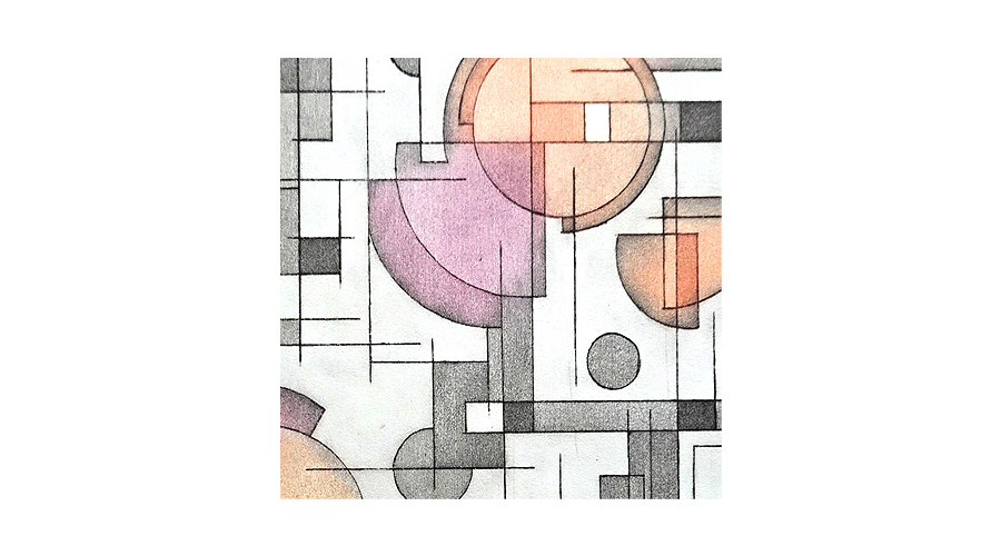
 The motif on the left has an industrial feel, the look of a sprocket – it feels metallic and solid. I am drawn to the line-work in the other designs; tank treads, tires, ridges on a tin can, corrugated fencing or roofing perhaps?
 I chose my colour palette:
 I drew:
 And I designed:

I won’t go into great detail regarding the pattern repeat but, briefly, this is the layering:
- 2 separate plates for the yellow scribbled background, each 3 blocks deep and 2 blocks wide – each repeated once to the right. 70% opacity.
- 1 plate for the ‘treads’ – repeated 4 times and aligned with the background.
- 1 plate for the sprockets – offset against the other layers. Fully printed towards the centre right of the design with partial repeats to the left and right.
Contrary to how this image looks on-screen, with limited sizing, it can be repeated both width and length-wise. It would also adapt easily to other colour schemes.
I see this as an upholstery fabric. Wish I could have a feature chair in it.
Resources:
http://www.wallpaper.com/design/marion-hall-best-modernist-interiors-museum-of-sydney#pic_204945
https://sydneylivingmuseums.com.au/exhibitions/marion-hall-best-interiors-0
Marnie Fogg, 1950s Fashion Print, Published by Batsford, London, 2010. Designs: Kinetic 147 & 135, Abstraction 23. ISBN 978-1-90638-888-1
Corrugated images from google search.


Leave a Reply