
Monotype printing
Today I had a complete change of pace and direction. The first three designs for this project have been carefully thought out and executed. I decided to try a landscape without too much planning – the never-ending quest to be a little more spontaneous. An urban landscape was, after all, the choice I made when deciding on my theme even though I’ve strayed from it.
So no drawing, no super-planning, just a look through the material from Cronulla and my day at the beach that I already have. I’d done these very basic surf club and apartment block drawings.
 They were very small so I blew them up and zoomed in, moving around until something caught my eye.
 I have no confidence in my drawing or painting ability unless I’m working randomly with abstraction or have hours to spend with pencil and eraser. However, I remembered my course with Gary Shinfield and his insistence that I loosen up and try things that didn’t have to be perfect. So I picked a ragged brush, a couple of cheap hard rollers and mixed up inks galore. For the first time since starting this course I deliberately thinned the inks to a very runny consistency and hoped they would flow like water-colours and I would be able to ‘paint a picture’.
My base plate was perspex which was taped down with my enlarged image reversed and sitting below it. My paper was taped to the side of the plate – sort of hinged so it could be placed over the plate and lifted like a book page. This was actually quite good fun. I was determined just to have a go and be satisfied with my results no matter how they looked. No agonising over it.
 OK, interesting. The rough brush gave me about what I expected. Now let’s try a quality smooth brush and see if I can refine it a bit.
 Wow, what smooth strokes – what smooth inks!! Obviously I need the ink very runny to be able to paint using brushes. At the very end of the course I’ve finally understood monotype printing with brushes and how professional artists get such wonderful transfers and soft smooth finishes.
However, as I looked at my pieces I was ….. well, what was I actually feeling? I pinned them up because I knew something was wrong but not what it was. I sat looking at them for a while and then it came to me. I was bored. The images were boring, they were totally static, there was no life (that’s because I didn’t know how to draw any) and even though I’d learned the inking lesson they were boring me. I realised I was pushing myself into a place I didn’t feel any connection with. I was looking to demonstrate that I had learned these techniques though the course – but I didn’t know what I really wanted to print with them.
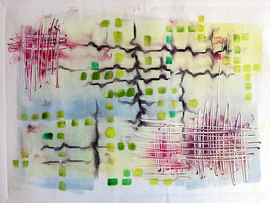
 BUT I am interested in the buildings and I’ve worked on apartments, reflections and the like in previous courses. So instead of looking at my initial source material I considered what the terms ‘apartments’ and ‘unit blocks’ mean to me. What do I visualise when I think of them?
- pigeon holes
- circuit boards with all the components lined up
- stacked dollhouse rooms
- lines and connections
So I moved everything I’d done out of sight, turned the music up loud and drew exactly the way I see big multi-storey buildings. I totally ignored how they actually appear and just created my circuit boards of connections, similarities and differences.
 This was the direction it was painted but there is the possibility of turning it, although I prefer it in its original orientation.
 Conclusion

Well I only just managed to save myself today. I nearly went with the ‘what I think the course examiners want’ view.
I’m worried that they won’t understand my piece and that’s one of the reasons I’ve not pursued this path before. I like abstraction but it is so incredibly subjective and must be murderous to assess and mark. What if everyone thinks it’s rubbish and I’ve just produced a piece of total guff? I need to accept that and stand by the piece I’ve done. I like it and it gives me so much more than my first two pieces.

Pingback: Print 1. Project 15: Review | TactualTextiles
Pingback: Print 1. Assignment 5: On-line submission | TactualTextiles