Beach towel design: Reduction lino print.
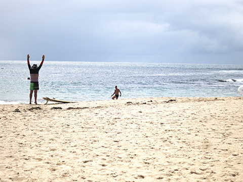 It was a beautiful day at the beach and I spotted a man stretching just before going to surf. The sea looked way too calm to me but, hey, what do I know? I liked his shorts (wonder if they were Billabong?).
 I started drawing, simplifying and adding components to form a balanced composition.
But I still liked his shorts, so I looked more closely at them.
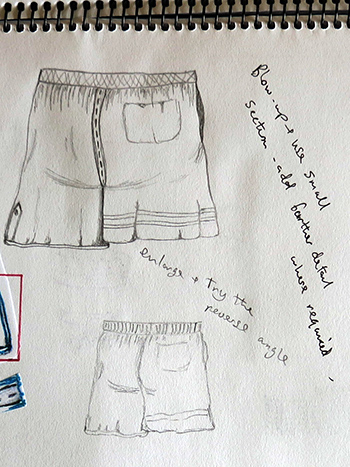 Further detail was added and I enlarged and reversed the image. Much of my trials are done on Photoshop which is tedious to record on my learning log but progress is easy to follow without too much step-by-step.
I blocked out areas of interest, initially using paper ‘L’ shapes. Then continued playing with these areas, on the computer: cropping, repeating, resizing, joining, etc.
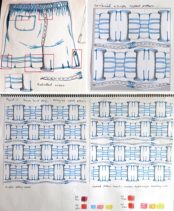 I chose reduction linoprint as the process because I’d only done it once during the course and found it a huge challenge.
NOTE: The following photos have been taken with a window to my right so one side of the prints look lighter than the other. However, in reality, they are even throughout.
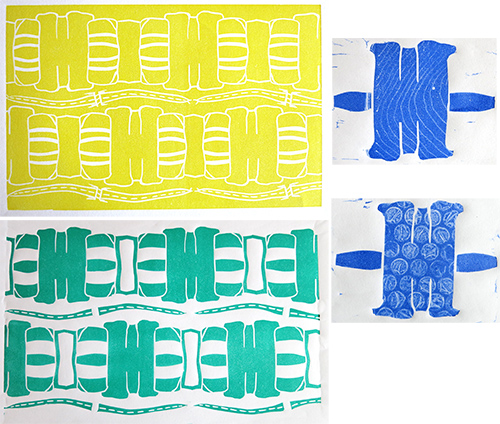 I proofed each layer. I thought the dark top layer might be too heavy so I added texture with a rubber wood grain tool and some bubble wrap. Wasn’t sure I liked it.
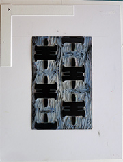
I made a new registration jig. The lino fit exactly into the cut recess. The edge markers were 2 1/2″ from the print area to allow plenty of hand room to situate the paper in the corner without accidentally touching the printing ink. What could go wrong?
I considered my paper choices. I would have liked to use heavyweight damp paper but have issues with that. For a single layer or multi-block print damp paper works very well: the transfer is excellent, the finish is smooth and the ink bonds evenly and deeply to the paper.
However, with a reduction lino print there is a considerable time gap between printing layers which means that the paper dries out between each run. Paper stretches when it is wet, it can slightly distort. Then it dries. I know from experience that it doesn’t dry back to its original size. Once dry, the original inked plate will never register accurately over previous layers. There is the option of keeping the paper damp by setting up a type of enclosed plastic ‘tent’ around the initial prints, thereby keeping the paper from drying out. Or paper could be left to dry and then re-wet later but that means leaving several days between runs so the oil based inks can fully cure and do I have confidence in this method? No. So I continued with lighter weight Japanese papers (+ a Hahnemuhle trial).
This design has been created to form a band at either end of beach towels, continuing my theme of beach-wear and accessories. In this case the towel would be yellow with the two further layers being printed either as this single layout across two lines or reduced in size with further band repeats.
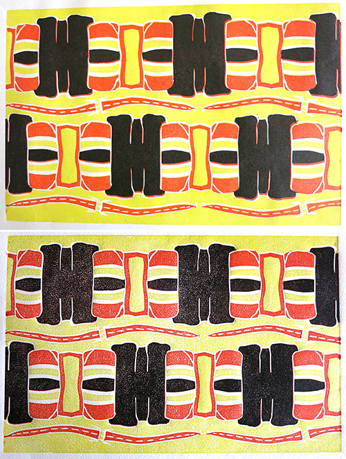 Both prints with yellow (hansa yellow light & chrome yellow hue mix), napthol scarlet and black. Top: Genshi paper. Slight misregistration on the final layer but I actually like the orange shadow around the black – so I’m happy to live with it. Bottom: Hahnemuhle 150gsm. Couldn’t resist trying the print on a textural surface and it’s given a speckled effect throughout. This is a great example of a paper that would have picked the ink up perfectly had it been dampened.
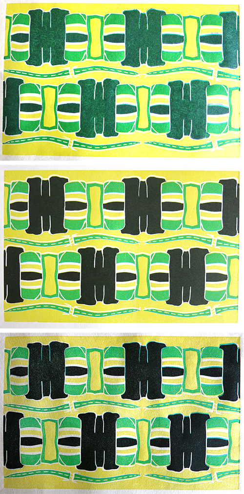 The prints are evenly inked throughout but the sunlight through the window has affected the right hand side of the images. The red was swapped with pthalo green and in the top image ultramarine blue was used in place of black.
Top: Kozo heavy. Texture added to top layer with bubble wrap. Hate it. It just looks like the ink hasn’t taken well as the imprint is very undefined because of the colours below. Middle: Awagami Bamboo – a beautiful paper. Back to black and with no texture. The best print of the day. Bottom: Kozo 60.
Conclusion
A very painful exercise. I absolutely tried my best, chewed up an enormous amount of time and confirmed that reduction lino printing is neither my strong point or my passion. My preference is for multi-plate images where colours can both mingle and stand alone in their own right forming a more complex colour outcome and also cleaner effects. I’ve discovered I’m not a fan (so far) of translucent colour mixing where they only sit atop each other. I have lost the vibrancy and crispness of my original palette in this work. I was aiming for bright, fresh, primary colours to convey summer, the beach and fun times. I don’t think it has quite hit the mark.
I like the design but, if I did this again, I would use the multiblock method to keep my colours separate, strong and clean. An excellent learning exercise though.

Pingback: Print 1. Project 15: Review | TactualTextiles
Pingback: Print 1. Assignment 5: On-line submission | TactualTextiles