Having made the print plate I’m in a bit of a quandary about how to print it. Monochrome seems pretty boring but could also be effective if I can work the tones well. If I want to try this I think it would be better to make it one of the final run because I’ll have to use something quite dynamic and rich to get a decent effect and it may not clean off properly if I later decide to go the route of multiple, more subtle, colours.
So I lined up my oil inks and started having a play. I should do this more often as it’s very satisfying seeing new colours emerge. All mixes contained around 35-40% extender and were applied to general visual art cartridge paper with a spatula, hence the slightly uneven finish.
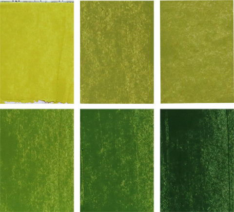
 Top left to right: 1: Hansa yellow with a tiny touch of purple (made from quinacridone red & grey + ultramarine blue & grey). 2: Hansa yellow with more purple mix added. 3: Hansa yellow with grey.
Bottom left to right: The middle sample from the top row (sample 2: Hansa yellow with purple) was combined with a mix of pthalo green & quinacridone red (pre-combined into a dark green). Each of the three bottom row samples had progressively more of the pthalo and red mix added to deepen the hue.
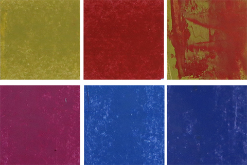
 Top left to right: 1: Chrome yellow and grey (A). 2: Scarlet red and grey (B). 3: Sample 1 overlaid on sample 2.
Bottom left to right: 1: Quinacridone red and grey. 2: Ultramarine blue and grey. 3: A mix of the previous 2 samples (it looks more purple in real life).
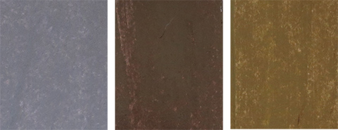
 Left to right: 1: Neutral grey. 2: Sepia and grey. 3: Previous sample plus a pre-combined mix of chrome yellow & grey (A).
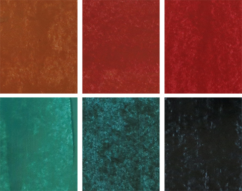
 Top left to right: A combination of (A) & (B) from the second colour set with progressively more (A) being added (finally worked out how to get the russet reds I love so much).
Bottom left to right: 1: Pthalo green and grey. 2: Pthalo green and quinacridone red. 3: Pthalo green with much more quinacridone red (just got to love these!!).
Several hours were whiled away as I mixed and played with the various combinations. Now I have to consider how to incorporate some of these new variations into my collagraph plate.

Great set of colours. Will you be printing on white paper?
Trying a variety but nothing with too much colour. I’ve used some of my ‘natural’ coloured Elephant dung paper and some of the slightly yellowish Kozo (which never photographs propertly).