 Working from this drawing I made a few months ago my aim was to translate it into a single colour linocut whilst maintaining as much detail as possible. The questions I started with were:
- Can I create a dimensional image when only using two colours, ie: the printing ink and paper source?
- Can I create shadowing, thereby grounding the image, when only applying one colour?
- How much detail can I realistically expect to keep?
- How on earth do I create light toned laces when the surround will also be light? How will I define them?
I’m getting better at judging tonal values on coloured images but still find it useful to translate an image into grayscale and assess the range from there. I manipulated the image in Photoshop, using the tools to push the tonal variations so I could fully understand them. I also looked at it in reverse. Then I redrew the image (in reverse) to a larger size so I could judge how much detail could be cut.
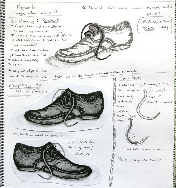 Quite a lot of thinking about laces at this point.
The drawing was photocopied a couple of times, testing the size, flipped to the correct orientation so I could assess how it would look finished and then applied to a new background and the surround was added.
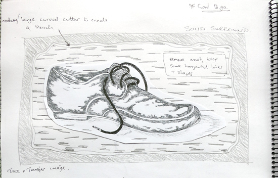 A tracing was made, this image was transferred to the lino and I started cutting. Once done I took a rubbing (see below) to check how it should turn out (still in reverse, of course).
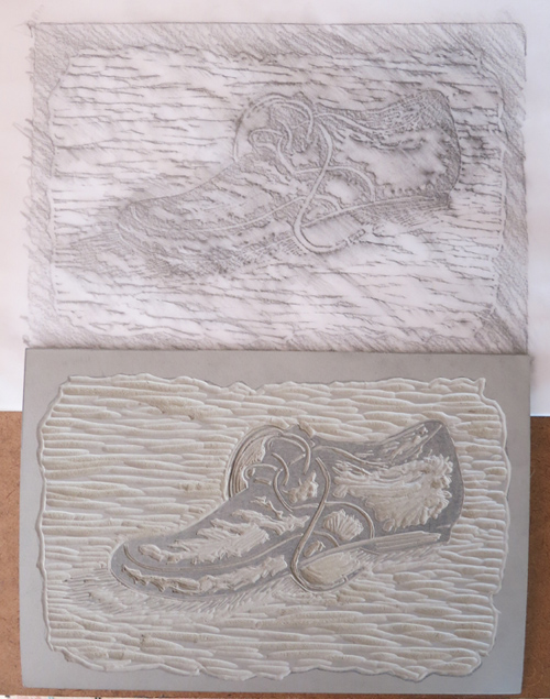 Part of the back left-hand shoelace crumbled away as the lines left were very fragile.
Note: Before the comments come flying in about how ridiculous it is to try to leave tiny printable strips whilst cutting away huge surrounding areas I’d like to note: I read the manual, I read my textbooks, and I fully understand that you can’t do this and that you run a real risk that narrow print sections will crumble. BUT, where would be the fun in it if I just accepted what is written without having a go and experiencing this myself? I want to try everything – if it doesn’t work, so be it, but I want to experiment and see what I can do.
I chose black ink as my medium, mostly lightweight paper and a mix of hand and press transfer methods.
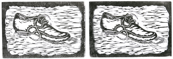 Above: Left – 110gsm cartridge paper. This went through the press but the pressure wasn’t tight enough so I put it through again. Some slippage is evident. Right: 110gsm cartridge paper. Tighter press pressure and better transfer of ink but, again, the paper moved as it went through. These problems are easy to see around the edges of the solid outlines.
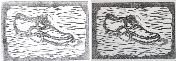 Above: Left – 110gsm cartridge paper. Ghost print of the top right hand sample, hand transferred. Right – 200gsm grey smooth paper. I pressed this by hand but still got some slippage, in fact it is very smudged. I think I applied too much ink to the plate and it travelled across the paper as I used the barren over the back. This is clearly shown on the laces where they have totally lost their definition.
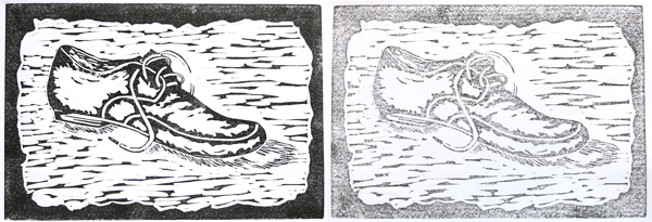 Above: Left – 110gsm cartridge paper. Good ink application, good coverage, no slippage, pressed by hand. Right – 110gsm cartridge paper. Ghost print, pressed by hand.
I’m very happy with these two and they have shown me the benefit of carefully transferring the ink by hand pressure instead of using the press with lightweight paper. It doesn’t seem to adhere enough to the inked surface to stay 100% in place when going through the machine. I’m sure it is the weight of paper, because some edge crumpling also took place.
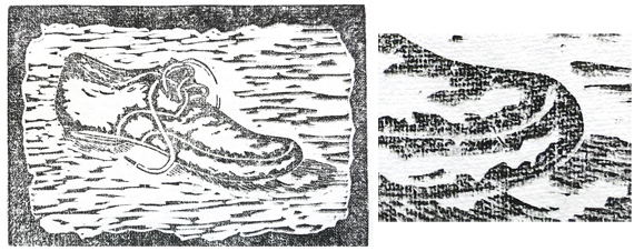 Above: 145gsm Lokta paper. This paper has an almost invisible grid pattern in it. It’s from the deckle when the paper is handmade. Once the printing ink goes onto the surface it becomes very apparent and it also spreads the ink slightly, across the ridges. This gives a painterly canvas look to the textural surface. So, no, this time there was not a skerrick of slippage but the entire print looks slightly out-of-focus due to the nature of the ink seepage across the texture. I could have printed on the other side which is smooth but it would have just looked like all the others.
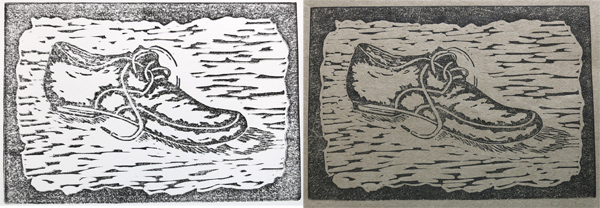 Above: Left – 250gsm Arches smooth, pressed by hand. With paper this thick hand transfer becomes difficult. It was checked several times and more pressure was applied to encourage the ink to move from the lino to the paper. Next time I might try dampening thick paper and then putting it through the press. I should have a better registration template ready by then (my first attempt has some flaws which I’ve identified and am currently rectifying) and it should help a lot in holding the paper in place. Right – Mingeishi Grey (no weight specified, but about 70gsm). There is no question about it, this is the best paper I own and have used so far, although I have a couple of other types yet to try. It has a smooth satin finished side and a matte slightly coarse side. It’s the latter I like. The mud-brown colour has a faint greenish tinge to it and most colours (excluding blues and purples) sit beautifully on it. The ink doesn’t smudge, the prints are accurate and sharp and it gives me the crisp look I’m aiming for. Coverage could have been marginally more solid but I’m not unhappy with it.
And finally ……..
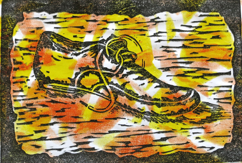
In my course last year I had an entire section on screen-printing, which was fabulous. Before applying the screen to fabrics I made many trials on photocopy and brown packing paper. They’re rubbish but I kept them. Today I have applied my shoe design over a very random waste piece. Obviously the background isn’t the same size as the print so the piece will be cut to size and mounted on to something else. It was just for a bit of fun.
 Analysis:
I’ve really enjoyed this. Due to being away, and then illness, it’s taken longer than anticipated but I’m very enthused to do some more.
Cutting the lino hasn’t been as difficult as I thought and I’ve found a successful way of warming it to help as well. Cleaning the lino after printing is horrible, time-consuming and difficult. I find that once it is wet it curls terribly and I have to put the piece under heavy books to try to flatten it. I’m thinking that reheating it a bit might help here. I’ll try it anyway.
So, how do I feel about the crumbled away laces section on my block? It has only enhanced my work and I’m delighted that my prints aren’t as ‘picture-perfect’ as my orderly, neat and precise personality strived for. In addition, I feel I’ve successfully answered the 4 questions I set myself at the beginning of this section.

There are so many things I admire about this.
You deliberately and knowingly broke rules.
The variety of marks which let you make two colours do so much more.
The framing.
The sense of exploration and inventiveness.
The thoughtful way you considered what worked and didn’t work _for you_ in each variation.
Joyful and exciting.
Thank you so much, Judy. I spent a lot of time considering this first single-colour subject matter. I made several errors along the way, all of which I’ve learned from, and which I’ll cover in my assignmnet wrap-up but this has been an extremely rewarding experience as I’ve progressed a lot.
Bravo Claire. i love the work and I am glad you ignored the text books.
Thanks for the support, Gail. Whilst lino-printing has to have a certain planned approach I still want to be surprised by the results. And I have been.
Judy said it so well! I admire the rule breaking too, and the thoughtful planning. And I do like the results. One thought occurred about the lino curling up – you might glue or tape it (double sided carpet tape is good stuff!) to a piece of board or similar, to give it more robustness and prevent it curling so much when you clean it. Adds longevity too..
Thanks for the comments, Nola. The tip about the carpet tape and board is also very useful. I’ll buy some tape tomorrow as I’m sure this will make a big difference.
Unfortunately, I’m still very under the weather so things are going slowly, but I’m on with the next ideas.
Pingback: Print 1. Assignment 2: First relief prints | TactualTextiles
Pingback: Print 1. Project 15: Design 3 | TactualTextiles