
In April I worked on a design of the Kunsthaus (Art House) and speculated how my outcome might change if sections of it were hand-coloured.

Having pulled several prints at the time I decided to apply colour to a couple of them. I used heavily water-diluted Brusho pigment powder to achieve the look.

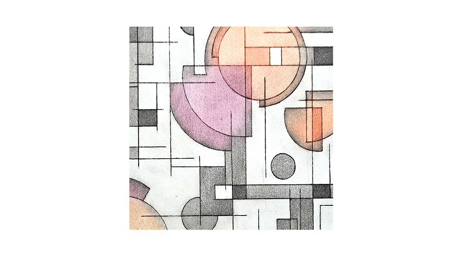
The two prints were substantially tonally different before the colours were added. You can see the one on the left had a lot less plate tone, it was wiped more cleanly than the second. This has given the added colour a fresher, brighter look. So, when hand-colouring, this is something to keep in mind as the remaining plate tone has the potential to muddy the overlaid colour.
I’ve had these pinned up for a few days while I assess the outcomes. Frankly, I prefer the original version. I feel more depth and engagement in it, and it’s simply more attractive to me.
An interesting exercise and I’m glad I did it. I’m sure other projects, mine or my readers, may benefit from this technique but in this case I’ll stick with my first version.


Leave a Reply to Daisy Hill StudioCancel reply