
After my last trials on white paper I moved to printing on coloured bases.
My backgrounds were made by rolling various acrylic paints onto damp plastic sheeting and smoothing paper over the surface, thereby transferring some of the paint. Unfortunately the photos don’t pick up the gold shimmer that sits within these monoprints and they look a little flat. However, in real life they do have a glow.
 As I thought, the yellow mix disappears into the background. Shame but expected.
 I’ve had orange in mind right from the first day and the design sits well and is very distinguishable, but now I’ve seen the colours together outside my imagination I’m not so keen on the outcome.
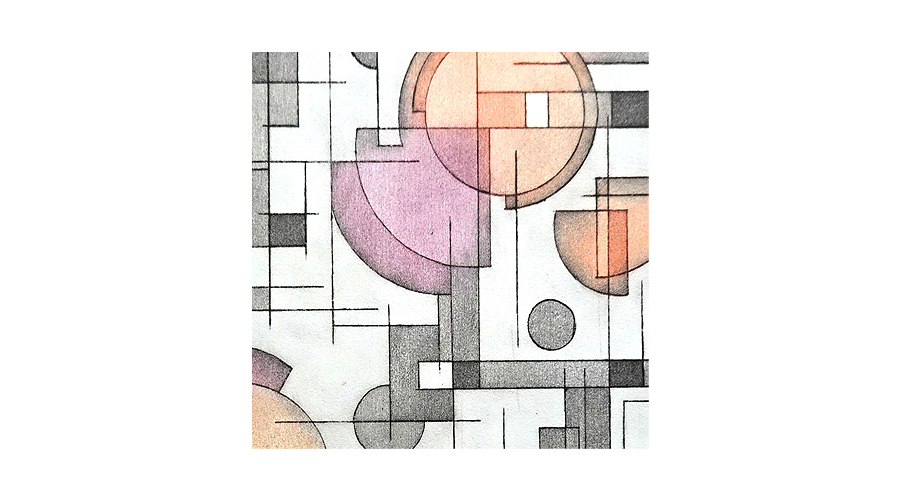
 OK, now it’s coming together.
 A slightly different background, more blue/green than yellow/green and I’m loving what I’m seeing. I’m using these 2 green sets for my book project.


Leave a Reply to Claire BCancel reply