
This term in my print class we’ve been looking at reduction lino printing. I think it’s very clever and the effects can be stunning but it’s not particularly a technique I embrace myself. However, by altering the idea slightly – adding a mask on occasion – I produced a reasonable page for my Connectivity book.
Working through the design:
 Producing the print:
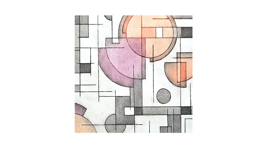
I started with a mid grey, placing a mask over the bottom half of the design so only the top printed. From this point on a mask was applied over the top of the print to maintain the base grey colour. Green was printed on the bottom half and then blue was printed over that, once more of the lino had been cut away. The press pressure was reduced for the blue layer, creating a mottled effect.
 More of the lino was cut away and the final black layer was printed over the top, forming the final print.

Well, it’s not bad. The result is about what I expected. When I bought my lino from the art shop every piece came with the same fault down the middle, hidden until inked up, hence the annoying line down the centre which is quite evident in the grey area.
This will still go into the book (probably) but reconfirms that I’m not really a reduction lino print person.


Leave a Reply