
Having enjoyed experimenting with printing collagraphs from a paper pulp matrix recently, and having three more ready and sealed, yesterday I chose another one to work with.
Due to the high profile of these textural plates, as can be seen in the image below, it is easy to ink up using toothbrushes to get into every crevice but very hard to wipe away surplus ink from the deep recesses.

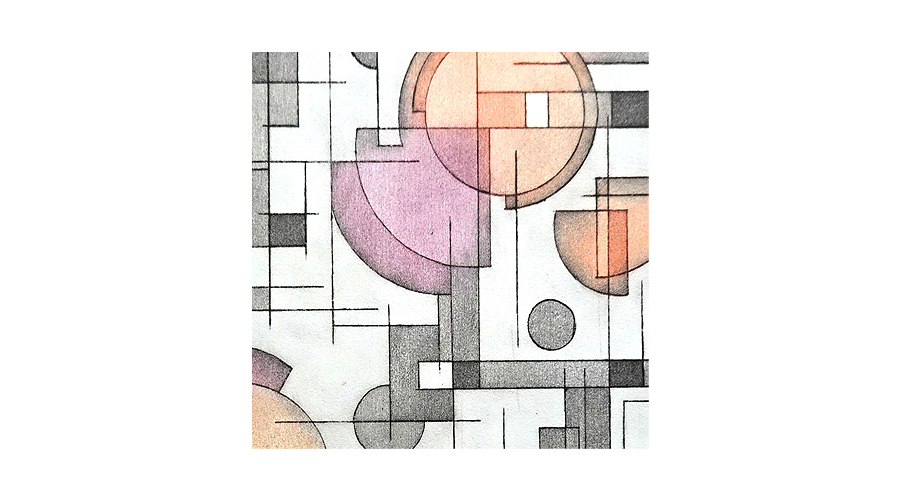
Whilst these paper pulp plates have a very limited lifespan, probably only good for a maximum of 4 prints because they compress through an etching press, the prints themselves come out heavily embossed. So there is not only the illusion of depth of image in the application and removal of ink but also from the heavily embossed paper itself.
For full details on the preparation and printing process please see my previous post on this subject HERE.

I prefer this plate design to the last one I printed and the result is substantially better.
Why is this significantly better all round? What changed between the two print sessions?
- In my previous post, using the pulp plate with the circles design, I had a definite demarcation line between the two main colours – red & yellow ochre – each segregated to opposing sides of the positive and negative section of the plate.
The plate above is a simple all over embossed design and I allowed the colours to overlap and blend which has unified the design and created a more pleasing visual outcome - I gave more thought to the colour choices I made. I was aiming for an ‘aged fragment’ look and these colours have produced that.
- This time I understood better the amount of ink required to produce a decent transfer to paper.
These paper matrices have gloss varnish on the back, enabling them to be easily wiped clean of accidental ink pick-up.
However, the front (the part to be printed) has 2 coats of satin varnish which normally only gives a slight sheen to a collagraph plate surface but not in this case. The satin varnish has remained on the tightly compressed paper pulp and formed quite a shiny appearance, almost like wet ink, so it’s hard to know if you’re overwiping. Is it the shine from the varnish or the excess ink you’re seeing when wiping the plate? - In both print sessions I applied a roll-over across the entire plate using Charbonnel Paynes Grey. The original circles plate shows this quite dominantly in the first print but once it had flattened (for the second pull) it caught some of the lower areas and became more integrated into the finished print.
In this second session the grey has immediately blended better with my other colour choices and combined well into the overall outcome.

Working with these paper pulp plates has opened up new printmaking possibilities.


Leave a Reply