
Project: Forging Connections
So far it’s been a pretty big year of printmaking and a small year of recording my journey on this blog.
The beginning of the year saw me working on both zinc and aluminium etching plates, to be combined into layered tonal compositions (see post here). I loved these plates and eventually designed a set of stencils to go with them and created a book entitled Fighting Entropy (see book progress here) which was selected for the 2025 Northern Beaches Artists Book Awards exhibition.


The lines and tones I created continue to hold my attention although I’ve printed several other styles of design since completing the book.
An opportunity arose to submit for an exhibition entitled Connections and I set about working in a similar way but a bigger size.
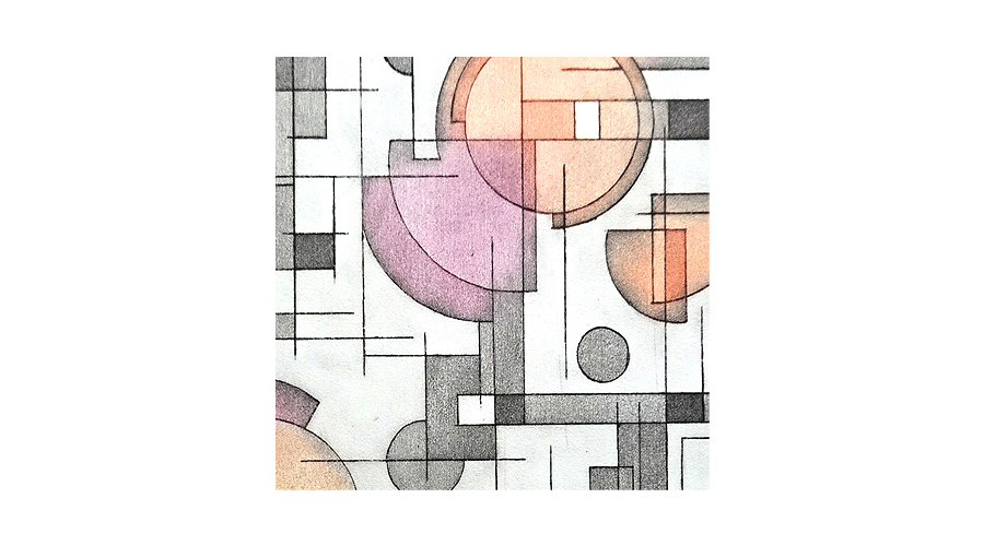
I often wonder how abstract artists decide on a start point for their works. I’m a big fan of a focal point, or focal area, and in my case it’s often situated within the top right quadrant so that’s where I placed my first circle.
Continuing with circles I added different sizes, balancing the composition by eye, and gradually started adding lines and erasing elements to break open some of the shapes.
So this became my base design.
Using an aluminium plate, liquid hard ground and an etching needle, once the design was transferred I drew into it then etched in copper sulphate solution. The plate was cleaned and a print proof was taken.
From here I proceeded to incrementally block out areas whilst continuing to etch, thereby creating a range of tones.

The plate was cleaned and the first print pulled.


Above left is, I think, my preferred outcome. It’s a little moody, the colours blend well and it reflects my temperament at the time. It is what I was hoping for. However, after pinning it to my art board and walking past it for a couple of weeks I realised it was just that bit too dull to be attractive and engaging hanging in an exhibition space.
So I went a little more intense with the colour choice. It’s notable that a simple change, but within the same hue, can cause such a shift in result. Both pieces use Fine Art Inks Stormy Grey and Charbonnel Geranium Red but the first iteration has Charbonnel Sanguine as the third choice, whilst the second has Charbonnel Primrose Yellow.
So why is there no obvious yellow, why is the brighter area orange? It comes down to a difference in inking technique.
In the first piece – to the left above – each colour was carefully applied to the specific areas I wanted it, wiped back and blended as I progressed.
In the second piece Geranium Red was firstly applied over the whole plate with the surface being wiped fairly clean. More intense wiping back, achieving partial removal of ink, was done over the areas I wanted the other colours to be more prominent. The grey and yellow were then aspplied to their specific areas over this base colour. This created a more dynamic print result, but, of course, where the yellow was placed over the red it became a vibrant orange.
Overall a great experiment but I’m not sure I’m finished with this plate yet. The design is meant to be flat, and it is, but I feel something is missing, as if it’s too one-dimensional. In my mind, to take this further means a radical change and I’m considering printing it plain grey on a base of multiple coloured chine collé pieces.
Take-away: Never create a design, print it, be dissatisfied and discard it. If you’re not ready, or able, to develop it further just put it away and come back to it in the future. As we evolve we discover new opportunities and these stored works often come into their own further down the track. How nice to have a stack of art pieces to draw on later.


Leave a Reply